Saturday, October 24, 2015

What is Saturated Color?

You hear me talk incessantly about "saturated color" all the time in class.  I am often sure it is clear, but in fact it may not be.  What I mean by including saturated color in your work is applying the color in a loaded brush, pure way.  Often I see people load their brush timidly, then stretch that load out endlessly till it loses all it's brilliance and "saturation"  What I encourage you to do instead, is think of every brushstroke more singularly, more "sculpturally", so that it has it's own voice in a chorus of brushstrokes.  They then all sing separately together, to make a choir, a brighter painting.  I include a couple of paintings here that I did in class as demos to illustrate the point.  Again the subject is not the point, the brushstroke is.  Each painting is a landscape in itself, each stroke a voice in that country.  

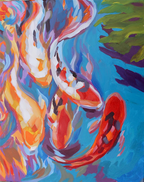
" KOI Color" demonstration for the Fleet Landing class in Mayport, illustrating saturation of color and showing the idea that placing one color next to another creates the illusion of brightness.
 Another version of "Tropical Color" above.  I have done this painting many different ways over the years.  This one was done rapidly, and in a more layered way, starting with warm magenta and orange base sketch washes, and building brightness through layering in of saturated strokes one on top of another.


Above: A watercolor demo of the same idea, placing each color separately and graphically next each other to achieve a brighter mosaic or cloisonne effect.  
 
 The painting at the bottom of this post "Let your imagination fly" is an oil painting by Emma Lee.  I teach the same lesson in oils, acrylics or watercolors.  She was entering this painting in a contest and as the teacher I was proud to show her work off here!


Friday, October 16, 2015

Getting the bounced light !

The watercolor lesson in class yesterday's Reddi Arts class, was to contrast the lights against the half light and bounced light in the shadows.  This is illustrated (not that well I must admit) in the watercolor below (it's a tad overworked and tight).  It is a particularly difficult lesson, and you will have to practice a lot with blue and purple glazes over the yellows to get it right, without overworking it of course.  We determined having the right small to large square brushes, is particularly helpful in this type of work. Try to practice this till you get loose with the work.  The tendency is to "render" rather than get the impression of the place.  Review Sargent's watercolors of Venice to see the better way to go here.  He was the master to emulate.
Anyway, below is the progression of shots from sketch to final touch-ups (which I did at home) taken during this exercise.  I hope you will find them helpful!


Sunday, October 11, 2015

Feeling is the Point

Capture The Feeling
In both of the watercolors here you see the background is an important player in the "atmosphere" or mood of the piece.  Feeling is a big part of any successful picture.  Getting the background right and utilizing the wet into wet techniques accurately are the real challenge in the opportunity presented by this challenge.  Master this technique and you will go a long way to achieving your choice and any variety of moods in future work.  This could work with stormy days, moonlit nights etc.
In the "Olympic Seashore Fantasy" I used the masking fluid to mask off parts of the driftwood drawing, but what is unique here is that I left bits of the lines in the wood exposed when applying the mask so the background wash colorized ( naturally uneven, good!) the lines in a random way that is harder to achieve painting detail with a brush in the classic way.

Above: "Olympic Seashore Fantasy"- 14" X 20" Watercolor on Arches Watercolor paper.  
In the background of the top piece I was going for a cooler feel, as in the great northwest, and in the bottom piece a more tropical warm look in the mist using more pink mixed with yellow to make a warm orange. 


Above: "Florida Riverbank Fantasy"- 14" X 20" Watercolor on Arches Watercolor paper.  
Remember with reflections, the cosmic principle applies, "as above so below"! Let the watercolor do the heavy lifting using the "wicking" techniques I rail on about salt and scraping effects.
Homework:  George Inness was the master of oil paintings with great atmospheric effect.  Explore in Google his work for ideas, then try something like it in watercolor, acrylic or oils!

Todays Wednesday Custom Art Lessons

 Here are some students engaged each on their own paintings, I help each one at their unique level. Each of my students are amazing creative...