Saturday, September 10, 2016

Building a Torrent of Waterfall Color


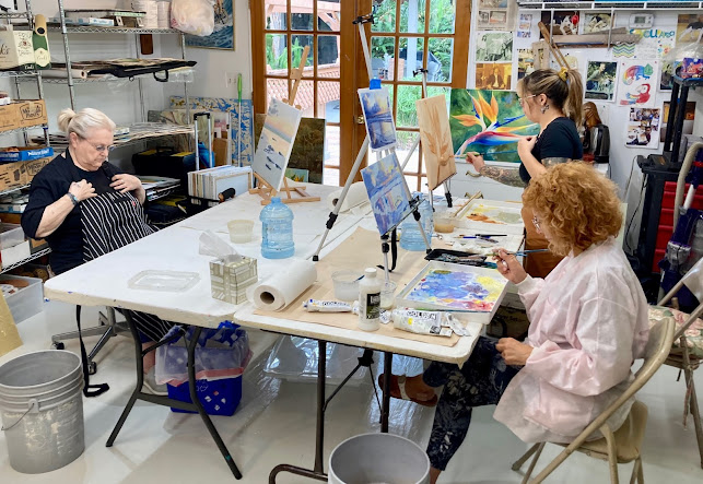
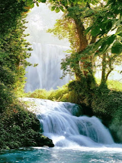
I like building my scenes slowly. Some may think I am too timid, but I want to make sure I insure that the whites are reserved in all their luminous shades.It's the way light actually bends and moves through objects in space, so the light seems to actually be on the painting itself.  Here is how I do it, in this case a Waterfall Demo at Reddi Arts one of my teaching venues.


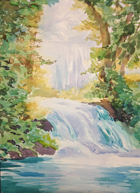
As you can see this initial "ghost" painting (no pencil in my case) is design to both "draw in" and map out the structure and the light.  I am not interested in shadows or detail, just light.  The background is the most important since in this piece the light is behind the trees. 


I slowly add hints of the waterfall and build the wet soft light gradations wet into wet.


Once the water is fleshed out (not fully detailed yet) I move to the yellow of the forest color.  This tells me just where the warm light hits the leaves (always the yellow and lights done first).


I build on those yellow colors with my sap greens, olive greens and start moving toward the "cool temperature" greens, the chromes, sage and blue greens for the leaves in shadow.


Not that a series of "light" relationships are established halftones and shadows can be introduced.  I mixed up some burnt umber and red and blue to get a more interesting cool shadow.  Burnt umber by itself can look a bit dead, so the other two colors in the mix add some luminosity to the shadow by adding a shifting light spectrum within the mix.  I gradually move out of the shadow using burnt sienna mixed wet into wet so there is some transition to the light.  
I have also taken this moment while the watercolor in the waterfall wash is still slightly moist to add a bit of detail to the aqua colors. By doing this while it is slightly damp it gives the stroke a soft gentler edge, I also add some light purple shadows in the shadow areas.  


I keep up this method building detail with a color related to the burnt sienna, raw sienna, a more golden light, because the leaves closer to the light would have more yellow than blue (the cool/warm on the color wheel concept).  Always be cognizant of what the temperature of your place is in the picture.


Above you can see I am starting only now to move deeper into the cooler shadow greens with cerulean and chrome, sometimes olives.  I worked a bit to try to keep an interesting aqua edge to the waterfall that both had color and softness for the cool spray on the water. Some leafy shadows above are added here with olives and a bit of cerulean.


Last, with a bolder set of multi-color cool blues, and aquas, light thin purple, I do horizontal strokes for the water ripples while there is still some moisture in the paper.  If not when you put the light purples in first, then add the cool aquas boldly on top using slightly overlapping strokes in a horizontal fashion.  Be cognizant of the glow from the waterfall and the light on the water that must mirror that.

And that's all there is to it!  

Friday, August 5, 2016

Santorini Color gordonmeggison.blogspot.com

Our last acrylic class at Reddi Arts was designed to be bold , move quickly and be juicy.  We want to employ and leverage our neutrals so they make the bits of scattered color look bright and exciting.  The white can have varieties of color , the neutrals can run the range from taupes, to golds, to blue greys.
The photo resource is something I pulled off the internet,  so we'll just call this exercise, "Santorini Color".  It is ideal to work from your own photos or experience, but I am teaching paint technique, so this suits my purpose.


Step 1:  Here we go starting with the tonal sketch (mapped out first in pencil) using thin watercolor washes, then deeper shadows added with burnt sienna and burnt umber.  Burnt sienna is my go to color wash for starting any painting.  It has a quality of "light" showing from underneath the painting, as if you are painting on gold leaf.  This will become evident later.


Step 2: I set up my acrylic palette, and start mixing with the emphasis on the neutrals warm to cool.  Here I am not using glaze liquid.


Step 3: I started placing these neutrals in their appropriate light to dark
relationships, remembering the "Bounced light does magical things" principle!!
To make my cool grey neutrals, I used raw umber, raw sienna, and copious amounts of white.  I used raw sienna and white with very small amounts to make a warm version of that to use in tile and shady grout areas.  For lighter brighter areas I used raw sienna and white.

 Step 4: I started working in some cool neutrals using cerulean blue and white and another mix with some raw sienna mixed into the blue mix for the dark tile stones
 

Step 5:  Keep adding varieties of neutrals one on top of the other fleshing out the highlights.  On the white wall you can see I used a variety of warm whites and cool whites for grout highlights.


Step 6: Time to start adding the greens that go under the flowers I mix a little sap green raw sienna, and burnt umber to get glazes that let burnt sienna under painting show through.


Step 7:  After laying in a variety of green leafy strokes, leaving some of the burnt sienna showing through.  Next I started working the flowers in with white, raw sienna, and a tint of  red, to create a warm white onto which I will put a warm raw sienna red and a bright red. To create the flowers I use a semi-circular strokes, placing the flowers in light  vs dark groupings.


Voila!

Thursday, July 28, 2016

Watercolor Memories

Cannon Beach, Oregon, a dream of light
expressed as Haystack Rock
In a watercolor memory 
I'm on a trip without leaving the farm


Turbulent Paradise

The power of a place like McWay falls is in it's class with the elements, but it's gentle design, and it's mythic looking waterfall, that has surely inspired a thousand artists.  The object here was to use more powerful brushstrokes, which can be difficult in acrylics, due to the shrinkage in the paint,  I had to build up the paint on the brush more than normal to get this meatier look.   Here is a step by step of  my view of McWay Falls as taught in the recent Reddi Arts classes.

Right: The reference photo I worked from. This is difficult light, as it is midday and darkens the details too much in the camera.  As a painter you have to color correct, and paint in the haze and luminosity as you remember it.  Don't slavishly copy photos. Pick out and edit what you want to keep and eliminate or alter.


1. Lay in a preliminary sepia half tone, a classic way to begin.


2. Halftone complete, I start high and work down, sky first, keeping the premixed colors wet into wet, juicy open strokes, not too blended.


3. Start adding distant neutrals.  Trees and rocks in distant have a bit of haziness, so tone the greens down with white and blue, just block them in.


4.  While doing step three, bring lighter neutrals to the rocks. Have a variety of blue greens premixed so you can just dip the brush in and go.  Much more efficient, so you can work wet into wet.

Above: A closeup


5. Start blocking in the water.


5. continued -  Using a variety of aquas and purple greens. 
I started some in the grasses with raw sienna


6. Getting a bit more action in the surf


 7. Added dark greens, blocking in shadow areas.  Using a bit of sepia in the green for depth.


 8. Adding a variety of greens in a side corner stroke with the square 
brush or filbert to add movement and color to the grasses.


9. Adding light colors on the dark blocked in scaffold of color, to add luminosity and definition.


 Closeup Note: see mauves in water, make the water deeper and appear to have sea grass underwater.


 Closeup of surf and rock


10. Adding finally touches, flowers , brighten highlights.


Simplifying A Complex Scene

Todays watercolor subject at Reddi Arts


was taken from Pinterest,  a little town in France called Crestet.
It is similar to a watercolor I did years ago (1992, and later included in my "French Light/Florida Light show) in Castelnou.


Here is a look at it  Castelnou done plein air on location.


When I did "Castelnou" I used a film camera, and my photo wasn't so great to work from, so for class I took this next image from Pinterest, which offered much the same challenges as Castelnou. 


The process of breaking down a complex image like this can be daunting, but we will give it a shot.


First step, the drawing and the masking fluid.

Step 2 Below: I lay down the warm washes that define the overall warm shapes in the stones 


Step 3 Below: Adding purple washes into that as a glaze later, gives the work an in shadow effect 
without graying down the luminosity of the stone work, and displays the sense of bounced light.


Step 4 Below: You can see I am starting to delineate and slowly intensify 
the cool shadow zones allowing the color to breathe in the color field spaces.


Step 5 Adding intensity to the warm colors, more glazes in shadow areas.


Step 6 Below:  
I start adding the yellows and greens and further map out the shadow areas more 
distinctly.   Notice in the lower right I put the cool "in shadow" blues for the plants
 below the pot then painted the shadows in "negatively" to bring them "up" while
 leaving them as simple color fields, not overemphasizing the details unnecessarily.


Step 7 Below:  I start mapping out the tree and some branches (don't
 go branch crazy here, less is more, you can always add more later) 
and dark green details in the foliage. Some architectural details are emerging.


Step 8 Below: Remove the masking fluid to see what you have, remember
 the masking fluid is to maintain the whites, not the shadows, 
you have to think backwards here, always preserving the light.


Step 9 Below: This is where it gets interesting, you are slowly pushing the ranges of dark
and light and working the boundaries to mine and leverage your warms against the cools.
Example:  Look at the purple shadows, then next to them there is a little burnt sienna next to that,
bridging the light to the dark so you feel a shift in temperature.  I also boosted the cool blue wash in the wall left, to get it more in shadow.  Note: I probably could have been bolder here.


Step 10 the finale: final touch ups and color tweeks are added here, accents etc.


Friday, July 8, 2016

Painting With Light


During a recent watercolor class at Reddi Arts, I realized, while trying to explain what I was doing to the students, that I was really "painting with light"!  Watercolor is a different kind of painting experience, a lot like herding cats.  With oils and acrylics you can force the medium to comply with your intention, by correcting ad infinitum.  With watercolors you don't have the luxury of "fixing" your mistakes easily.  You have to cautiously plan out your moves in advance, requiring forethought and skill.  Mostly you are putting the lightest colors from the sun, on first.  I put these on with yellows or golden tones made of raw sienna, and work around the color wheel to the cool colors.  I save the darkest accents til last, not rushing to them too soon.  Here below is a mediteranean scene from Eze, France, I downloaded the photo from Pinterest.   It served as a good example of bounced light into interior spaces, such as the garden left corner. 


My approach to watercolor is a bit different and was another part of the lesson plan.  I do not do preliminary drawing first.  This of course is scary to most, but if you are brave enough and have reasonably good drawing skills, and OBSERVE the subject for a long time you may find my method is faster and renders a more light filled result.  I lay in the lightest color first as shown below

While the drawing is being developed I am using a lot of water in my mix changing colors from warm to cool in the spaces as needed , and letting the colors bleed or "wick" a bit into each other naturally.  This gives the final work a more light filled look.  It is as if I am "painting with light"!

With stone details I try to understate them a bit 
to keep them from looking overworked and stiff.
I will add the darker stone shadows later.


 I try to be cognizant of the the light and where it must be brightest,
 ALWAYS reserving it in some light version.  Once it is gone, it is gone, 
so pay attention to the light.   I concentrate on the lighter versions of the 
color of the shadow areas, waiting til later to move to stronger shadows.


I wanted to get the trees in, although I will go back in and add more depth to 
the cottage shadow wall later.  First I wanted to see the wall in context of the
 background trees to know exactly how deep to make my shadow glaze mix.  
Doing the green, I starting with a warm yellow mix first wetly.  To that I would
add the various greens letting them wick into the yellows,  painting negatively
where the foreground bushes meet the background cypress.


Next I needed to start preparing where the overhanging tree would go
 so I could map out the sky colors so as not to place too much blue 
where later I would need light yellows for the leaves.  I used light
yellow sienna washes here too, adding slowly the burnt sienna and blues 
later directly next to the yellow wet washes to allow for a natural look.


Below: You can detect the tree has mostly dried.  While this was happening 
I took the opportunity to add deepened dark neutrals into the wall shadow 
and behind the palm fronds.  Different levels of chrome green washes and 
bright yellow glazes emphasize the shadow and the light on the frond leaves. 
The tiles received a bit of detail glazes in cerulean blue cool tones,  contrasted 
by burnt sienna warms.


Below:   I tend to believe a bit less blue is better than too much.  I actually did 
the water seaand island first, doing the sky color last. Water and cerulean blue
mixed with horizon blue create sea and sky. Some purple is in the island.


Below: I started introducing bright yellows where the leaves were to go.  
Into that I would plan to add different yellow sienna and chrome greens, 
maintainingbright light filled leaves.


 It is important to create some dark leaves occasionally placed to 
"lead the eye" for composition. I added a few understated branches and a 
few darker greens for visual interest.


Above: The final painting  "Eze" Provence, 31cm X 41cm 
(12"X16" on Arches watercolor cold pressed paper)


Todays Wednesday Custom Art Lessons

 Here are some students engaged each on their own paintings, I help each one at their unique level. Each of my students are amazing creative...