Sunday, May 22, 2016

Glazes, Extender and Brushes, Oh My!

In this demonstration I was trying to familiarize the class with better brush control. It is important to use the right brushes for the right purpose and the right glazes or extender for the desired acrylic result.  In a cloud the "lost edge" is the hardest and simultaneously the most important effect in a representational piece.  I say that with the exception that an impressionistic piece is an entirely different approach, allowing a more painterly style to emerge.  In this case, achieving a soft lost edge is the goal.  I am interested in luminosity, the glow of a cloud as I see it in real life.  That is hard to capture in a photo.  Because of the layering of paint through glazing a "prismatic" effect can be achieved, creating the "illusion" of a luminous lit cloud on the canvas, when of course, in fact there is none there.  That illusionist technique is not practiced much in the art world today, but was a cherished goal in some classical painting.  It still can be satisfying today.


This picture was taken by a friend of mine in St Augustine Florida, Nancy Vail, who lives on the waters edge.  I call this Vails' View, since they see this first thing in the morning.  This little island is a rookery for birds as well and a channel connects the property to the Matanzas Inlet. She has invited us to stay many nights there so I know this scene well.


The first thing I like to do is break down the scene either in my mind or in sketch form, into a map so I know where I am trying to arrive in terms of the placement of highlight and shadow, warms and cools, and composition lines.

Above:  Next using a color wash on the 16" X 20" canvas to create a tone in the overall predominant color, I begin to sketch with a filbert the loose detail and composition.  I use the glaze in the brush to softly indicate the shadow areas.

Above: Next I add the yellows and cerulean sky color to "block in" the main body of the cloud and it's warm light versus the cool light of the sky. There should be a lighter transition using white in the sky mix, for horizon light.

In this case I am using a little glaze with a bright white flat Princeton #8.  I like the flats for this sort of work because they lay down a smoother application of glaze.  Do an area and leave it alone, it is not an oil and you don't have a lot of time.  Too much work will disturb the paint surface and make weird anomalies in the drying time.


Remember , you are working around the color wheel (see the left side) so as you move down the cloud toward the purples and away from the yellow, you may get a green if there is still too much, or any yellow in your mix, so as you move away from the orange into the purple shadow, remove the yellow from your brush and add red, use pink and add blue slowly.


 I just keep glazing in, adding small amounts of extender with carefully selected mixes of purples.
Extender is something you only use small amounts of, whereas glazing liquid you can use much more, but it dries faster too.  You can use both simultaneously to both thin and extend open time. This allows for multiple and sumptuous glazes one on top of another.  It is important though to let each coat dry or you will get a chunky surface to your painting that will not be attractive to look at.
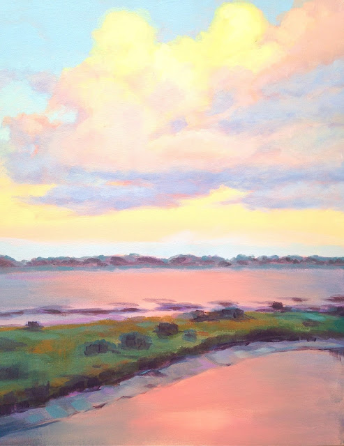


Here is the final result of multiple glazing, I still need to add some color to the area above the treeline, that will come next.
Below: The final tweak with some deepening glazes added to the water and a few extra strokes to the marsh grasses. 

"The Old Country Church" ,A Watercolor A demonstration


Friday, May 20, 2016

BIG SUR Atmospheric Watercolor Demo

A few years ago I did a trip to visit a friend of mine getting married in LA . After a wonderful time on the southern California coast, my wife and I took a road trip up to Carmel to see the Big Sur area, an area I have been longing to paint.  In class the other day I decided to finally take a crack at it, and we chose this view to demo.  So here is the breakdown step by step to capture the foggy atmosphere of this magical place.  I want to tackle McWay falls next! Stay tuned


1.  As you can see I started with a drawing, and masking fluid, using both a small brush and drafting pen to apply it for distant foam and small branches and flowers to maintain light color fields.  Then I washed in a 1-2 punch of mauve and cerulean for sky, being mindful of the fog bank in the distance, keeping a lost edge there where it merged into the sea.  I used a purple (rose and cobalt) for the distant ocean, and cerulean midway, and horizon as you get closer for the beach area.
 

 2.Using warm and neutral washes openly and in some cases dry brushed to set up the grasses and slope fields.


3. Distant mountain used blues and light magenta staying delicate to maintain a sense of distance.
Then I added bright and deeper umber greens for shadow grasses

4.  I removed the masking fluid.  I put yellow on the beach and a bush in the foreground, painting
negative space into the shadow with dark green allowing some evidence of
supporting branches underneath the bush.

5.  The overview , as you can see the big tree is not thoroughly fleshed
out yet, it could be left like that for a looser look.


6. I put a second soft neutral wash on the beach, they have to be done as
lightly pigmented glazes.


7. This painting is taking on the careful "English style" of 19th and
twentieth century style classical watercolor methodology, which
concentrates on series of glazes for subtle shifts in tone in atmospheric
pieces.


8. Using the fan brush I put in a few grass like strokes, try not to
overdo the use of the fan brush even as it is exciting to use.
Be sure to keep good things that are happening already in the piece, so
as not to overwork the piece. KEEP IT FRESH.


8.  Adding yellow glazes at the top of the bushes in the foreground to
create highlights, I really should have kept some open white space there
for a more dramatic effect.
I also lightly color glazed in some neutral blue gray in the sage brush
under story so they would not be too white. Next added some preliminary
yellows into the flower areas and grasses. Used the fan brush again to
add purples, and blues intermittently for more grass details.


9.  Started added shadow and detail glazes to the hills below.


10.  An overview of the work so far. Compare to when we started session 2.
Colors have been subtly deepen using glaze technique.


11.  Working in the tree, I felt like I was missing a warm yellow highlight
in all that blue-green, so added yellow glazes in segmented method.


12.  Then added glazes of burnt umber and burnt sienna next to the yellow
green to warm up that left side a bit. Trees have warm
under stories usually because of the dead leaves that fall low, and the
branches themselves, so putting them into even a blue tree can add
structure and "grounding" to the picture.
I was also working the undersides of the tree canopy to add darker green
shadows, made up of indigo, chrome, even sap green and burnt umber.
I also put some cerulean blues up in the high parts of the trees in the
outside to make some branches look farther away.


13.  I was using the Hake brush lightly as I moved away from the big tree,
sliding downhill toward the bush, still working with the shadow color, I
finally ended up on the top side of the small bush, with a light negative
space glaze detail to delineate the bush a bit to help show off the
yellow, which til then was merging too much into the background.


14. Another overview so far.  I believe I hit it yet again with some burnt
umber to warm it a bit next to all those cool greens.


15. This photo is poor, but I am showing some detail around the
flowers using "C" strokes to surround the yellow flowers a bit with green
which helps to bring them out a bit.
I also put in some horizon blue and cerulean blue and green upright
strokes in as negative space strokes around the sage branches to
strengthen contrast.
Try no to over work this, a few strokes is all you need.  Let the water
do the rest!


16.  A detail of the work around the downhill slope, creating shadows and
warm and cool spots, as well as directional lines, see the hill details.


17.  The Mountain in the background seemed too strong so I put a
bit of water on the left side and gently lifted some color there,
then put a couple of light blue glazes carefully on the right shadow
side of the hill for contrast.


18.  I added some color glazes to the ocean and foam, a thin glaze to bring out the fog bank a bit,
this is effectively a finished overview. I plan to add a bit more color to the sky and ocean next.

Saturday, October 24, 2015

What is Saturated Color?

You hear me talk incessantly about "saturated color" all the time in class.  I am often sure it is clear, but in fact it may not be.  What I mean by including saturated color in your work is applying the color in a loaded brush, pure way.  Often I see people load their brush timidly, then stretch that load out endlessly till it loses all it's brilliance and "saturation"  What I encourage you to do instead, is think of every brushstroke more singularly, more "sculpturally", so that it has it's own voice in a chorus of brushstrokes.  They then all sing separately together, to make a choir, a brighter painting.  I include a couple of paintings here that I did in class as demos to illustrate the point.  Again the subject is not the point, the brushstroke is.  Each painting is a landscape in itself, each stroke a voice in that country.  
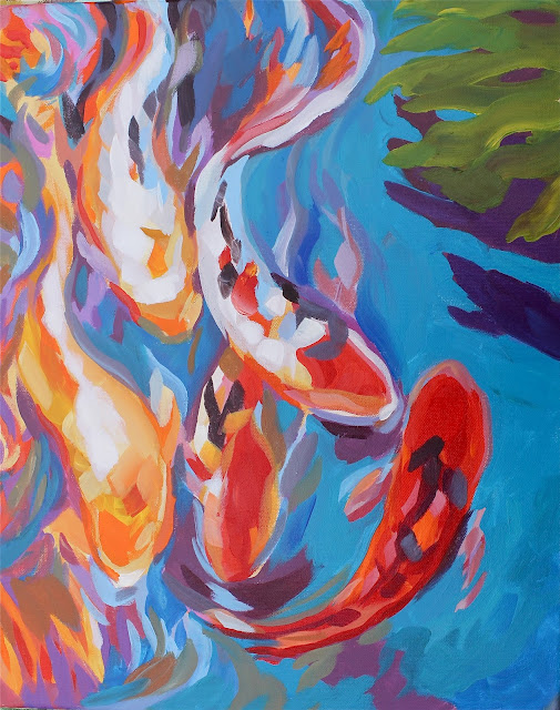
" KOI Color" demonstration for the Fleet Landing class in Mayport, illustrating saturation of color and showing the idea that placing one color next to another creates the illusion of brightness.
 Another version of "Tropical Color" above.  I have done this painting many different ways over the years.  This one was done rapidly, and in a more layered way, starting with warm magenta and orange base sketch washes, and building brightness through layering in of saturated strokes one on top of another.


Above: A watercolor demo of the same idea, placing each color separately and graphically next each other to achieve a brighter mosaic or cloisonne effect.  
 
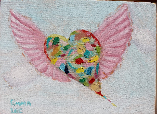
 The painting at the bottom of this post "Let your imagination fly" is an oil painting by Emma Lee.  I teach the same lesson in oils, acrylics or watercolors.  She was entering this painting in a contest and as the teacher I was proud to show her work off here!


Friday, October 16, 2015

Getting the bounced light !

The watercolor lesson in class yesterday's Reddi Arts class, was to contrast the lights against the half light and bounced light in the shadows.  This is illustrated (not that well I must admit) in the watercolor below (it's a tad overworked and tight).  It is a particularly difficult lesson, and you will have to practice a lot with blue and purple glazes over the yellows to get it right, without overworking it of course.  We determined having the right small to large square brushes, is particularly helpful in this type of work. Try to practice this till you get loose with the work.  The tendency is to "render" rather than get the impression of the place.  Review Sargent's watercolors of Venice to see the better way to go here.  He was the master to emulate.
Anyway, below is the progression of shots from sketch to final touch-ups (which I did at home) taken during this exercise.  I hope you will find them helpful!


Sunday, October 11, 2015

Feeling is the Point

Capture The Feeling
In both of the watercolors here you see the background is an important player in the "atmosphere" or mood of the piece.  Feeling is a big part of any successful picture.  Getting the background right and utilizing the wet into wet techniques accurately are the real challenge in the opportunity presented by this challenge.  Master this technique and you will go a long way to achieving your choice and any variety of moods in future work.  This could work with stormy days, moonlit nights etc.
In the "Olympic Seashore Fantasy" I used the masking fluid to mask off parts of the driftwood drawing, but what is unique here is that I left bits of the lines in the wood exposed when applying the mask so the background wash colorized ( naturally uneven, good!) the lines in a random way that is harder to achieve painting detail with a brush in the classic way.

Above: "Olympic Seashore Fantasy"- 14" X 20" Watercolor on Arches Watercolor paper.  
In the background of the top piece I was going for a cooler feel, as in the great northwest, and in the bottom piece a more tropical warm look in the mist using more pink mixed with yellow to make a warm orange. 


Above: "Florida Riverbank Fantasy"- 14" X 20" Watercolor on Arches Watercolor paper.  
Remember with reflections, the cosmic principle applies, "as above so below"! Let the watercolor do the heavy lifting using the "wicking" techniques I rail on about salt and scraping effects.
Homework:  George Inness was the master of oil paintings with great atmospheric effect.  Explore in Google his work for ideas, then try something like it in watercolor, acrylic or oils!

Friday, September 25, 2015

Taking a Watercolor theme to acrylic.
Demo : Color over Water" 18" X 36"  Acrylic on canvas 


In my Fleet Landing acrylic class I was trying to help the class tap into their inner poet, going with the flow, while exploring painting technique at the same time. In my example I was also showing how to do the roses using a saran wrap technique to create texture.  The green part was using a watercolor wash technique while the right side I added heavier paint to create texture as a base for transparent washes.  Editing with opaque compliments did the rest, trying to keep the color strong and saturated. I like the colors to be fresh bright and luminous. It was based on the watercolor below.

A class demo at Reddi Arts "Pine Island Revisited",  14"X 20" Watercolor on paper.

This piece was a bit different for me.  Normally I would start the sky wash, then while the paper is wet, work in the trees and reflections slowly.  In this one, I did the sky and water first, blew dry the paper (thoroughly), then drew on the tree design in pencil and masked the background negative space around the trees.  This process will cause the color to lift a bit (a lot) so you can put the sky color on richly.  In the upper right you can see I left the sky open (during the masking procedure) to add a bit of purple to the sky there.  The idea here is to work loosely inside the tree design to let the color intermix freely in a fractal way.  I added salt after the color was applied in trees and water reflections. 
It takes a long time for the salt to dry so take your time before removing salt from the surface so as not to spread color around the paper.  When I was certain everything was dry I removed the masking fluid to see what I had.   I had to add color that was lost in the sky as a glaze wash where needed.  Finally I added touch ups and tree details such as branches.  I like the sculptural feeling, the calligraphy the negative space masking creates.  I would say this was a successful piece! 

Saturday, September 19, 2015


I love watching my kids in oil painting class work .  This one in particular is very talented.  I like the way she just goes at it directly and with out too much timidity.  She doubts herself from time to time, but in a healthy self analyzing corrective way.  Here she is at 8 working on her cat painting.

Friday, September 18, 2015

A Tale of Two Paintings, wet into wet and glaze over dry masked design!
It's been awhile since I have posted on this blog.  I had gotten distracted by the winds of a changing economic downturn and my many new responsibilities.  This particular post is still related to classes that I teach but soon I will start introducing other material on fine art in general and concepts I am exploring to date.
This image below, is one I did in a class recently for watercolor.  I particularly liked the poetic quality it has.  I was trying to demonstrate two different ways to produce this soft image, one using wet into wet watercolor technique (left) and the other using masking fluid first for the tree shapes then glazing wet into wet washes right over that (after the initial color had dried of course, a bit different approach)!

Todays Wednesday Custom Art Lessons

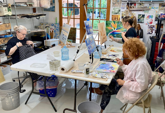
 Here are some students engaged each on their own paintings, I help each one at their unique level. Each of my students are amazing creative...