Artists often like to render the bird very accurately like a Basil Ede,
or Audubon, but there is a place for a looser interpretation of the magnificent bird,
without obsessing over every single detail, which can tend to leave the painting
looking a bit stiff.
This watercolor demo was done at Reddi Arts from a photo my sister in law took at a nearby pond.
In this case I started with the drawing, just the necessary clues, keeping it light, use a kneaded eraser for erasing.
1. I start laying in preliminary washes in the lightest areas building detail slowly.
2. Watch out for the birds legs they can get too big or too small easily. Egret legs are gangley and it doesn't take much to make them look worse!
3. Build detail slowly with light glazes alternating purples and blues for interesting combinations.
4. Once I have most of the bird structure worked out I move to the background, again,
working the lightest grasses and pond muck in neutrals first.
5. Start adding greens lightest first moving to dark colors last, allowing
wicking to happen on it's own. Let the water do the work! My Mantra!
6. I find it's best to do the dark colors carefully , less is usually more in areas such as grasses. Drawing every blade of grass should only be done if you want to do an Audubon style rendering.
A halfway rendered clump of grass can just look uncommitted, go a little abstract there, since
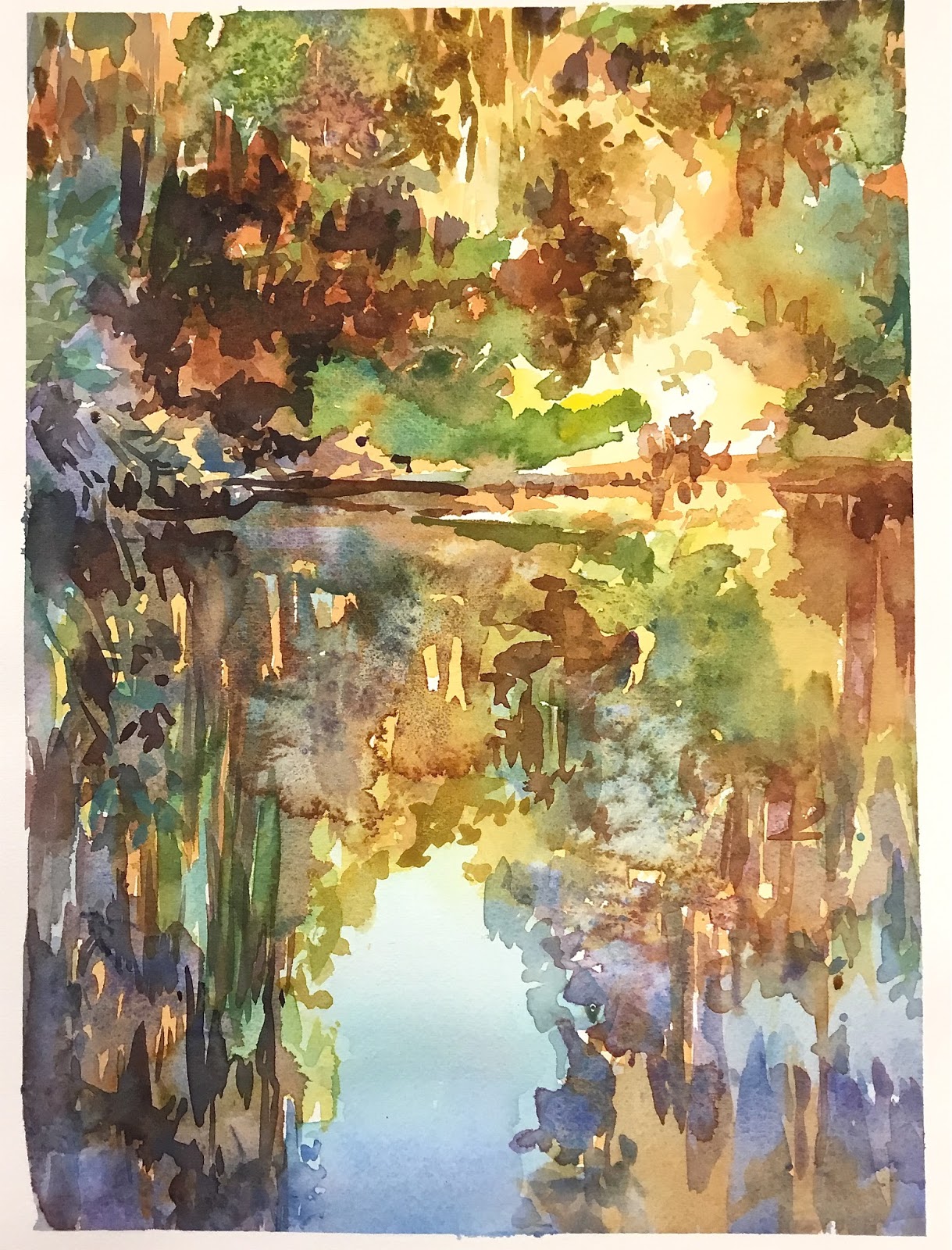
the bird is the focal point. I did the background in the upper area in deep purples and added salt.
7. I try to keep the water shadow reflection multicolored by keeping it as one unit, one color bleeding into another. Then I added salt. Foreground can have just enough detail to get the point across.
Enjoy the closeup !