Thursday, July 30, 2020

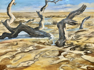
Rhythms of the Tides , A Continuance


 Here is a video tour of the final product, and after that 

I will share the step by step process in stills and video.

Here I illustrate the process of the latest Rhythms of the Tides oil 36"x48" 


1. Charcoal Value Sketch


2. Sepia and Raw Sienna wash value block in


3. Add Sky


4. Videos below show adding color to driftwood as illustrated above.


Getting Started with the Wet Into Wet Oil technique

Glazing with the wet into wet

Thursday, July 16, 2020

How This Bird From Paradise?

How can we pass by a miracle of nature such as the flower, the White Bird of Paradise, and not be moved by the wonder of genetic color manifested there?  How did this bird arrive here, how long did it take to fly through time and space to get here?  I wonder.  How did it decide to be these colors , rather than some other?
I wanted to capture some of the beauty around my own home, in the garden I have worked so hard to create.  Due to the lock down environment we are in, I am fortunate to have created a little green landscape bubble to live in, and rarely have before had the time to really enjoy and meditate on the beauty I have put before me. 
I did this large 36"x48" acrylic painting on a textured base of Utrecht gesso.  I did a crosshatch and swirl base technique with a large stiff brush on it so that it would present unforeseen sculptural anomalies to the application of color.  Texture lends a sense of the unknown, the surprising, and the abstract to the final piece.  It presents new opportunities to explore and inhabit in the color fields suggested in this magnificent creature.


Of course there is the initial sketch with charcoal.  I immediately started attacking each petal individually, but soon found that I had ignore my classical training and had skipped the preliminary ground wash on the base.  I wished I had because I was working to hard to get coverage of the white gesso.  "Kill the white" ! is the mantra, once you give the canvas a tone it sets the pace for the rest of the painting and makes the coats go down easier and more richly.


Below: Here I got wide a washed a tone of burnt sienna in over everything, thinly, 
to bring out the texture, then got on with the color again!  Lesson learned...again!


Here I was nearly finished, but for clarity I eliminated a few things and enhanced others.  You may be able to spot the slight changes in the final phase.  Play it like a kids game, spot the differences!


" Shadows and Dust " Why Fear, Where Courage?

Whenever we are trying something new, we are introduced to our old nemesis, fear!  Why are we afraid?  We are afraid of making a mistake, displeasing others.  When we do something we tap into creative power to change our environment and our destiny.  That also can tap into fear, perhaps we are afraid of an ancient fear of the envious, the critical, the guardians of the past.  When I started this painting I knew I wanted to do something a little different.  I wanted to play with color, but was not interested in doing something wild yet.  I love the sculptural qualities of driftwood, the twists and turns of the bleached wood, the strong shadow play on the sand.  The movement in the shapes of the boneyard trees gives them an air of humanity, or calligraphy, or even mythology.  I pursued the mythological and classical sentiments in a couple of the earlier pieces, but in this I wanted to push the envelop on the classical, into the color field area.  I had considered a more radical approach with flamboyant brushwork, but ultimately decided to pursue the sculptural line texture instead.  So another day for the flamboyant.  Baby steps!  My inspirations are from the work of Raimonds Staprans and Wayne Thiebaud. 

Below is the overview and below that a few closeups
to show the thin threads of brighter color added.


As you can see I was adding brighter color in the thinnest threads to push the edges like an abstraction, where the cool and warm light could meet and interact in the eye at the periphery.


I am adding here some early videos I made while in the process of starting.  I didn't have energy or time to show the later process, because I did not know myself where the process would lead!


Thursday, July 2, 2020

"Heading Out To Sea"

In these difficult times of self isolation, I figured it was time 
to do that classical style oil I always wanted to do.  I wanted 
to deliberately use all or at least some of the more time consuming 
techniques that involve use of more oil glazing and rich oil mixes.  
It makes everything take much longer to dry, but the look is more 
sumptuous.  It is a large piece at 36" x 48". I tend to work best at 
night, though I often wish it weren't so.  I have to get chores off my 
mind before I can dive into the concentration painting requires.  I 
did this piece over a three week period, but if I had worked more 
consistently I could have gotten it down to about a week, not including 
drying time.  The last coat was the most interesting.  After I got the 
sketching and base colors worked out, and I knew where everything 
went, I was finally able to loosen up the top coat.  I like it to 
look at once dashed out and carefully planned.  


Being a collector of coins etc.  I like to view my collection of progress 
when I am into a run of pieces, allowing each piece to inform the others.  
It also allows me to push my own envelope, trying to "allow" myself 
certain deference to my neurotic attachments to details, then to move 
past them and "allow myself" to get looser and take more chances.   
That make this my temple of sorts I guess, and color field health spa.

 The view of the studio, my faithful painting companion and 
a view of the workspace. Some times I will start in charcoal, 
sometimes directly with a filbert drawing with sienna or black.
I like charcoal because I can work out the composition and 
values with relatively little investment and it is very easy to 
change on a dime with a finger, smudge, or brush.
It allows me to visualize the final product in Notan notime!


Classic work usually lays down a wash with turpentine mixed
into the oil paint laying down thin layers.  Shadow and linear
details can then be used with a little less turpentine and map
out the darker areas, while wiping away the highlight areas
with a finger in a rag,  or brush damp with turpentine.  Then
minimal amounts of color quickly start to illustrate and bring
out the potential of the painting.


I liked the painterly way it was going, 
but I was not trying for such moodiness 
in this piece, so note to self, for next time.


So as I started making the final push to finish this, I noticed my 
brush dragged and tugged against the canvas and seemed to fight 
me.  I decided to use an old oil technique where you coat the 
whole surface of the piece with linseed oil, very thinly and 
carefully.  This allows the brush to glide over the surface with 
the paint allowing it to feel more like calligraphy than a tug 
of war.  It really added a juicy quality to the strokes and work 
ability of the surface.  It allowed me to  get soft misty strokes 
or rich saturated applications in little time or effort.

 Below: An Overview and a closeup detail zoom.


Friday, June 26, 2020

Last Day Plein Air at Panera's Courtyard


The dedicated ones caravaned with me over to the Paneras patio area, where I knew we would have access to a bathroom and coffee and croissants, while having some various still life subject matter to paint.  Florida weather starts getting warm by 10:30 so we wrapped it up by 11.  I was not on so much, but Patricia Liles showed up in spades to render a beautiful tropical plant arrangement.  Someone said "Success is not own but rented" on Facebook, but I countered with " Success is owned but built on"  When you work hard for a skill you own it and can then build on that!


Friday, June 19, 2020

San Marco ..Again!

 I made a major faux pas on this on at least three perspective issues, which plague many a drawing of architecture.  I am posting this now but I am currently working on fixing through erasing and repainting to hopefully mitigate the damage, so I will post before and after to help you see how I bounce back if possible from the brink of disaster

Ana, from Romania, joined our plein air group.  
In this graceful authentic position, she embodies 
the life of the plein air artist, relaxed, a little bit 
frustrated, ever hopeful and persistent!


Thursday, June 18, 2020

Todays Watercolor at San Marco

I just wanted to do a small study of the corner of the gazebo in San Marco , I have never done one just so.Here is my attempt.


One of my students did some work worthy of note, the lions were beautifully drawn and rendered into color, the trees were handled simply and with all the tiered levels of color Ii preach about.
 Here is the link to the easel I used:


Staying Loose

John Singer Sargent is my favorite watercolor hero.  His work was like that of a master bowman, whose arrow flies straight and true to the target most of the time.  His use of warms against cools, bold contrast, and bold use of color, great draftmanship and brushmanship always leave me breathless with envy.  Study is warm whites, his cool whites, his lights against darks, his light touch with detail, even in architectural settings.  His work has that nice balance of detail and loose painterly quality, resulting in a beautiful impression of the event.
Go onto google or buy his books, study his watercolors.  You will be better for it.

Friday, June 12, 2020

Thursday, June 11, 2020

Day 2 Attitude Adjustment!- of the San Marco Balis Park Plein Air Class


 The second class day of the Plein Air San Marco painting class
 went very well, especially compared to the first day when I was
 challenged to paint during the rainy weather.  I dispersed the
 group of 8 so that we could have different points of view
 and stay socially distanced. I felt like I started strong on this,
 a good solid sketch and bold open color fields laid down in  quick succession. 
The whites and their shadows are the hardest but the most rewarding if you 
can get them right.  The whites in cool
 shadows have more blue, when they get nearer the warmth you add a bit of
red. Never use black with water, it looks
 dull.  Work with open large color fields where possible.  Details always come last and reluctantly.

 I started working with a new easel , I like the table and 
it is lightweight.  The  cup holder is small, but it uses a
 small wax paper cup, you have to provide it.


Be patient with yourself.  Congratulate yourself for bravery because you took on one of the most difficult challenges in drawing and painting watercolors from real life. The difficulty can be remedied with simplicity and playfulness.  These are traits that you probably have not been rewarded in for some time.  Of course color mixing lessons don't hurt, and practice drawing is invaluable, practice makes perfect is still true.   But the magic ingredient is still playful loose childlike strokes that get to the point.  Having said that, I want to emphasize that's not to be confused with childish drawings.  There is a great deal of sophistication in simplicity.  Ask any zen master.  This brush, is linked to your mind, too much mind you have a problem, too much brush no mind you have a problem.  It is a balancing act, do you really see is the question.  To see, you have to study what you are seeing, not imagine what you are seeing.  That would be a drawing from your imagination, something different!   The open color fields are something to look for, less is more. 


Notice how bold the blue shadows the left were and
 how they barely show by the time the painting is done.
examine the details below:


The Times Union featured us in the METRO section,
 featuring us painting the first day after the rain departed 


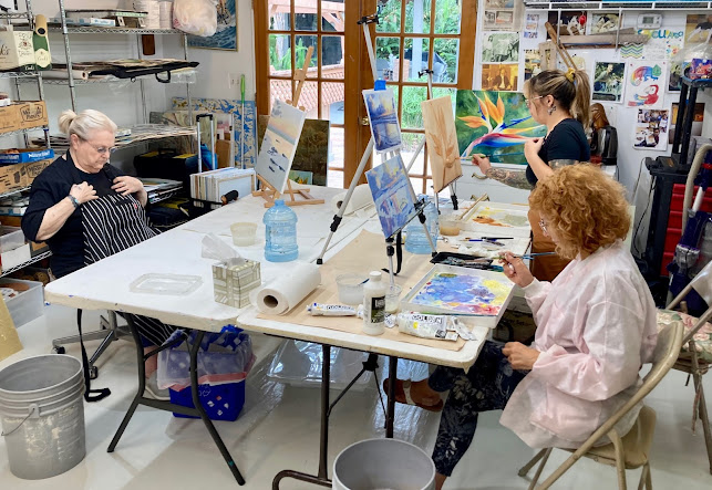
Todays Wednesday Custom Art Lessons

 Here are some students engaged each on their own paintings, I help each one at their unique level. Each of my students are amazing creative...