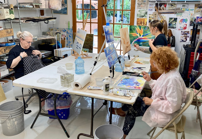
and PROCESS PAINTING IN ACRYLIC
Below: A watercolor abstract demonstration piece by Gordon Meggison

 A Syllabus
by Gordon Meggison
“What was I thinking?”
Of course there are no rules, but if there were it might be suggested these concepts observed on occasion!
1. CREATE SPACE
“Make the paintings breathe” Mark Rothko
Space is a priority for a good abstract. Rendering the feeling of space can be done in the way you handle line or color when forming a shape. The eye will naturally connect continuous and related lines or colors to form new relationships. These can make you feel open or claustrophobic.
“In looking you are part of the process” Tess Jaray It is meant to look totally simple...
“… we were taken out into the streets with our drawing tutor and I drew a row of trees into my
sketch-book, the tutor was scathing: you are only looking at the trees. What about the spaces in between? You wouldn’t even see the trees if they weren’t framed with space. And look, he said, the spaces in between also have shapes – imagine the trees as the edges of the picture, and framing only the space. You still have a shape. Perhaps even more interesting than the trees themselves. Well, I’ve forgotten his name… but I owe him much.
”Tess Jaray, in an interview with ‘RA Magazine’ [Spring 2014]
2. DECONSTRUCTION AND FLATTEN SPACE
Kazimir Malevich “logical consequence of no one ever being able to put back together the fragmented bits of cubism is that art should take the next step and abandon logic, embrace it’s absence”
By bringing the picture plane up to you, you flatten the plane, unlike illusionism which is the basis of classical art. Rather than create depth by perspective, we use light to dark color values and push the extremes of open space and filled space (details), bright and neutrals, to arrive at a juxtaposition of opposites.
3. ORGANIZING EFFORTS THROUGH COMPOSITION
Here you build the scaffold on which the color is hung. A certain amount of compositional knowledge of how simple shapes interact and relate is vital to finishing with a living, breathing work of art. Every image no matter how simple is composed of some line, shape. These immediately begin to seek relatedness and connection to one another the moment they are indicated. The tools are shape, value, line, color, contrast, texture, form within a space. Many designs are based on shapes of letters L, S, and Z, H, and T are the common ones. There is also radial balance, grid compositions, cruciforms, and many others.
4. CONTRAST
“Pay attention to the infinite subtleties of tonal shades in nature” Paul Klee Abstraction poses the question “What is perception” What is really seen when one sees anything?
We can only see any kind of form because of the way light reveals it. It is thru light and dark
that you understand the shape of anything- Biggs and Collins. Contrasts can result in drama and variety. Elements such as texture, color, tone, can create contrast by the juxtaposition of itself next to the empty or negative space around it. Tone is making an otherwise bright color lighter or darker
5. MOVEMENT
This is arranging the elements in composition to cause the eye to move or scan the art. Perspective and “bridge elements” can connect various points of interest, the eye will make the connection. Clutter is the result of bad composition, with no sense of where the eye should flow. Things just thrown at the canvas can be a good way to start but are rarely a finish.
6. EMOTIVE ENERGY
“Form is Feeling” Wassily Kandinsky
The art should have a dynamic sense of inner peace or active energy, it should seem alive, not labored or stiff. It is best if it just seems to have happened spontaneously, even though in fact you may have put in many hours on working the concept out. It is meant to be a process with hidden meanings.
7. LIGHT HARMONICS COLOR THEORY
Color is light, and science has transformed art by the understanding of light and codified it in the color wheel - colors opposite each other cause a vibration. If a color next to another in an abstract threatens to be out of step with the others, it can be changed and altered through tone, texture, glazing, impasto. I believe it should be in harmony with the principles of advanced color theory and light such as comes from the study of the color wheel and relationships revealed therin. You should not rely strictly on primaries though they have their place. Neutrals play a vital part in the total interplay as it sends it’s abstract message to the eye by making color look better.
8. LINE
Abstraction has elements of Japanese ZEN, and oblivion, chaos and perfection. It evolved out of an appreciation of line and the movement of the hand, such as graffiti, automatic writing , calligraphy, composition. Experimentation with line is critical to understanding and appreciating a good abstract.
9. REPETITION OF FORM
Repetition creates an interesting conversation with form and space, can be geometric or loose color. This creates a thing called “spontaneous order”, or a larger sense of itself. The forms do not need to be the same size, but can be. Pattern and Rythm can be features of this phenomenon. PATTERN: By creating a pattern of objects, then varying the tone or color of the elements lends a composition a sense of movement.
RYTHYM: When one or more of the other elements of design is repeated, that can
create the visual equivalent of a rhythmic beat in music. For example, if an established pattern manifests in multiple areas of a painting, it builds into a visual rhythm.
10. UNDERLYING IDEA or CONCEPT
Abstraction or process painting need not BE anything, nor even be explained. It should contain some elements of self assured mystery. It is not a rational process, it taps into the unconscious mind at it’s best. It reveals through primordial manifestation being “in the process of doing”. It’s about making very personal subjective choices. The merit of your efforts tends to stand scrutiny and the test of time if you have an underlying “experiment” you are working on, an idea. Abstraction allows an artist to be completely free to make something new, a personal physical inner vision, from the depths of one’s primal being. Artists choose to work abstractly because abstraction allows artists to be themselves, and to be free.
Abstraction attempt to be true to it’s own nature, and capture a higher reality,
beyond the visual representative world we see, that of illusion .
12. BALANCE : DIALOGUE, ACCIDENT, PLAYFULNESS, SPONTANEITY
In non-objective process work, even more than abstract, which “abstracts something from reality, you are in dialogue with yourself about your intent in the piece. Allow the canvas and the process to speak back to you, to have a conversation. A balance between conscious intent and spontaneous creative combustion are magic to a process or abstract painting. Be playful. It also includes willingness to try new things that may even feel a bit uncomfortable at first. You can always edit later. It’s only paint. Abstract art is trying to create something internal, something that doesn’t yet exist
Some of Helen Frankenthaler’s thoughts on painting:
“A really good picture looks as if it’s happened at once. It’s an immediate image. For my own work, when a picture looks labored and overworked, and you can read in it— well, she did this and then she did that, and then she did that there is something in it that has not got to do with beautiful art to me. And I usually throw these out, though I think very often it takes ten of those over-labored efforts to produce one really beautiful wrist motion that is synchronized with your head and heart, and you have it, and therefore it looks as if it were born in a minute.”
(In Barbara Rose, Frankenthaler (New York: Harry N. Abrams, Inc. 1975, p. 85)
The hardest part is Starting
Exercises: 1. take tracing paper or use a marker and find the simple composition structure lines underneath some of your favorite pieces. Look for the way the eye moves and find the focal point.
Arriving at The Concept-
1. Draw a grid, tape it off, on Yupo or cardboard, do a series of quick free charcoal sketches, tonal sketches then use calligraphy style brushes to quickly draw out the tones in black and white. Use calligraphy as inspirational start-like words on the canvas . Use sketchbook, alter what you wish, keep what you want, sketch composition drawings using gesture, line for future use. The compositions can be loosely abstracted from representational subject matter, be sure to reduce and simplify. Gesture, Line as a starting point- can be done with charcoal, brush, twigs! build a scaffold on which to hang the colors, be willing to sacrifice the drawing for the color
2. Mix a variety of neutrals and through repetition of form paint the neutral variants in linear patterns small to large , lightest to darkest, they can use linear or crosshatched strokes. Value relationships- use varieties of values and tones t get the most out of each color
3. Transfer sketch to canvas, apply staining washes liberally
perhaps Use Repetition of form exercise, add circles, loops.
4. Break image down. Carve large spaces with lines random - think neural network of your mind
5. Use large areas of flat color brushed on or even palette knifed, squeegeed or troweled on, in large saturated applications, allowing some of the underlying staining to peek through in areas.

7. Accent those with complementary , triadic, or analogous colors. Simplify and Flatten space
follow your muse- play off cools against warms, loud against quiet, neutrals against bright color,
space against detail, soft against hard, be willing to embrace contradiction, spontaneously
changing your brushstrokes and approaches constantly
Edit unnecessary detail where needed- It’s like destroying and creating at the same time” Paul Tonkin
8. Glaze applications over in isolated areas-could be whites or more staining glazes. Abstract Non-objective painting is adding, subtracting, adding again, breaking that down, editing and adding to that, in a layer of complexity or reductive process. Allow the process to unfold, be fearless!
Below: "Tropical Color 2" an acrylic abstract by Gordon Meggison

"Saturation and Simplicity" a watercolor 22"x16"


(Image right) History Note! Theosophy- Hilma af Klint-One of the first abstract artists was a woman and known then as a theosophist- Hilma AF Klint b 1862.
She predates Wassily Kandinsky the more famous artist renowned for seeing art as music. Her secret life was with 4 other women “the five” The Serpentine Gallery on You Tube)
Taking a Step
Techniques and Tools you can eventually explore, try and use:
A large variety of tools (and this is but a few) may be employed in acrylic painting
Fan Brushes and Oriental brushes- for bold simple calligraphic strokes, or crosshatch
Large brushes keeping strokes simpler, brushey or flat, crude or boldly graphic
Squeegee for long clean color field strokes
Palette knife -laying rich saturated applications of pure flat color down next to other colors
Pouring color or varnishes-allows surface of canvas to have different absorbtion or sheen
Glazes-use broadly and boldly, distress glazes where you alter wet surfaces to get optical texture
Scraping tools and Combs-
Sculpted Textural Bases-gel mediums, joint compound
Plastic Pressing (wire mesh, other patterned industrial found stencils)
Scumbling- for softness
Washes -pouring or brush wash, can also be wet into wet washes of differing color
Drip Technique (like Pollack) adds energy
Taping or masking- stencil- preferrably self made or modified Graphic Design- creating random
or carefully carved simple shapes in which sponge, opaque, transparent or washed to create soft or broken areas
Roller strokes using small and large roller
Negative Space- editing out previous work through negative painting with white or another color
Scratching away - remove top coat to reveal bottom coat
Multiple Opaque Layering - brush paint or palette knife-skip across surface to get open spaces
Multiple layering of glazed paint- applied openly with brush, or poured, scraped or knifed on
Geometric Designs- taped large and small Color blocks-order or random, squared or soft edges
Collage- application of fabric tissue etc to surface
Soft Edge- soft brushed color field areas one against another
Stamping- nautilus, shells, lace auto parts
Stencil- same as stencil or cut you own
Monotype- Putting paint (oil) on glass or wood and transferring to paper or canvas
Etching into texture- with pen or scratch tool
Pencil or Silverpoint on Gypsum
Cake decorator- to layer controlled texture
Embedded color -applied first, then after dry other color added over with knife or glaze
Deconstruction -by sanding through paint layers
Spray cans or spray pens
Types of materials
Paper or canvas, wood, cardboard primed, yupo can be used. Smooth or add rough texture base for other textured effects.
Acrylic tube paints, house paints, put your own colors in cake decorating sqeeze bottles
Glaze liquids and extenders lengthen drying time for special effects.
Plastic tubs with lids for large wash mixes for pouring or adding later
A Brief History of Abstraction: Many different Abstract Movements:
“What is Abstract Art”?
Abstraction is essentially about “Mark Making” and inscribing your personal spiritual DNA on the surface of canvas or objects , much like graffiti artists attempt to do when they try to self actualize on the streets. The difference is we are doing it here in the studio. Each persons’ view from the center of the universe is unique, and their language for interpreting that universe is unique, and comes from a deeply connected place to the source. So the theory is that every mark intentional or otherwise, comes from a deep inner need to make a stroke, texture, color wash etc. to describe the indescribable. It is ultimately about freedom to express what you want how you want, like a child, innocent and honestly. Editing and censorship are what we are immersed in daily, but art is personal and about cutting away from that.
Abstract Styles-
Bauhaus- Wassily Kandinsky
Suprematism- Kazimir Malevich
Cubism- Picasso, Cezanne
Lyrical Abstraction- Matisse, Jean Jose Marchand
Abstract Expressionism- Willem De Kooning, Antoni Tapies
Action Painting- Pollock, Franz Kline, Robert Motherwell
Geometric Abstraction- Piet Mondrian, Barnett Newman
Color Field abstraction- Rothko, Frankenthaler, Morris Louis, Patrick Heron, Kenneth Noland,
Sam Francis, Cy Twombly, Richard Diebenkorn, Thiebaud, Hans Hofman
Pop Art-Andy Warhol, Jasper Johns, Rauchenberg,Roy Lichtenstein, Jean Michel Basquiat
Minimalism-Barnett Newman, Yves Klein, Kazimir Malevich Frank Stella, Mark Rothko
Below: An acrylic by Gordon Meggison using acrylic texture media and color washes wiped on and off on metallic, and using some crackle medium


"Orange Sky" by Gordon Meggison 40" x 60" acrylic on canvas