Wednesday, December 21, 2011

Winter Watercolor and Oil Schedule


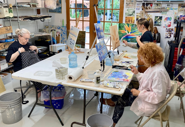
I am teaching at a couple of locations, Reddi-Arts(reddiarts.com) and JCA (Jewish Community Alliance www.jcajax.org)

These classes are for beginner to intermediate watercolor enthusiasts. Basic color theory, color harmony, composition, wash techniques basic painting skills will be taught

Reddi Arts Watercolor Classes Jan 13,2012 Every Friday 10 am- 1 pm, a 6 week course

JCA Watercolor Classes Jan 9, 2012 Every Monday classes 10 am -12pm, a 6 week course


This class is for beginner to intermediate Oil painting enthusiasts. Basic color theory, color harmony, composition, wash techniques basic painting skills will be taught


JCA Oil Painting Classes Jan 9, 2012 a 6 week course starting at 7pm - 9pm a 6 week course

Saturday, November 5, 2011

At class we were covering some simple background wash techniques, then adding a tree, which I rendered over the background , so here are the photos for the students to review of the two parts of the painting. I am following with a better older sample of the same idea.

Thursday, July 14, 2011

Build up Varnish and Pigment


Here is the latest driftwood addition to the family of new techniques I am exploring. I am moving this out of the studio today like a newborn child ushered off to adoption before I can fall in love with it :( I really love this piece, but it is for ie-designs, so its sold already. In this one I discovered a new technique where I put varnish down thickly and loosely then drop in loose wet paint directly into the varnish to let it ooze naturally together. Then I add other successive colors next to those and let them chaotically run together (controlled chaos) to simulate natural grain and weathering. The varnish becomes a carrier and allows the pigment to fall naturally to different levels, allowing light to pick up color and texture on many levels. Its hard to describe in words or to photograph.

Sunday, July 3, 2011

Imbedded color technique


I am working on a large set of acrylic paintings, a driftwood series for an interior designer Veronique at wwww.IE-Designs.com (from a reference photo I took from a Jekyll Island trip I took). In this particular set I was given a limited earth tone palette, and all color variations had to spring from it, making it somewhat monochromatic. Here are some pictures of the stages of the piece. First I charcoal on the drawing. I could have stopped there , I loved the way the drawing looked! Second I started laying in a ground base of the colors that I premixed and selected, and put into squeeze bottles. Laying these colors down was particularly challenging and confusing. The idea is to put joint compound over this after the color dries thoroughly, skimming on the tree areas, and texturing the other areas. This will be the second base on which Stage 3 will be to sand down and remove the joint compound glaze gently to expose the underground color I laid in in Stage 2. As this color is exposed gradually it takes on a life of its own. I will then in Stage 4 lay in glazes onto the new "white" joint compound to bring back in the appropriate shadows and highlights. (See the pic examples)


Friday, July 1, 2011

Using Masking Fluid For Flexibility

I wanted to introduce the class to masking fluid, to show the class how the use of it can allow the artist to free up the background for wet rich wash techniques without worrying about losing your "whites" ie: the light colors areas. I also added a liberal use of salt to add detail; to the background. Laying in the background can be intimidating, when you worry about losing the wet edge or destroying whites. Here is my new second version of the carp scene using the masking fluid, in varying stages. Stage one you put the masking fluid on the whole carp and ripple bubbles. Stage 2 The masking fluid is rubbed off. Stage 3 more masking fluid is applied within the fish for highlights or "whites" then the fish is toned freely with washes. Stage 4 Is final toning and details.
Lastly to make the fish look underwater, I lightly glaze over the fish with a thin wash of cobalt blue and viridian to "push" the fish down under the waterline leaving a bit of the original color in a few choice areas to make the fish appear to be bobbing up to the surface to eat or the fins rising as they do during their movements


Sunday, June 26, 2011

A Chance to Use Rich Color

I chose the carp design because it is an ancient symbol of good luck. I see it as a great chance to use color richly and wetly. I believe it is so because its hard to screw up a painting of these beautiful sensual creatures moving harmoniously together in water. The fish beckon to freely capture their color in loose wet colorful washes running together. This is the chance to discover the joy of watercolor! Here is the carp demo I did, but I believe some of the students actually succeeded at achieving the washes better than I in this circumstance. An example of the pupil exceeding the teacher!


Creating A Landscape Using Simple Values

I am presenting three approaches to the color value exercise while applying that simple lesson to a landscape. We covered this in the Reddi Arts class last week.


Saturday, June 11, 2011

Now and Zen, and a watercolor to boat experience!


I was invited onto the Now and Zen, a local Jacksonville charter catamaran sailboat, that is a joy to cruise on. Naturally I jumped at the invitation. To make things even better, the cruise that day was initiated by the Arbus magazine, because they wanted to do an article on the boat, and use a watercolor by me in the article for next months edition. This is why I don't have a "real job"! I am including an "in process" view of the watercolor and a final as it was accepted.

Stressing the importance of "water" in watercolors


At my recent Reddi Arts class, I decided to do an exercise or two that would stress the importance of water and saturated color in watercolors. Too often beginning students "starve" their paintings of the water in a watercolor painting. Water is the carrier medium for the pure pigment, as oil is the carrier of pigment in an oil painting. But the properties are completely different and cannot be overlooked. Oil allows the smooth distribution of pigment by continually brushing the paint. Watercolor is a minimalist activity, "where you let the water do the heavy lifting" ! Thats why I am fond of saying "Doing a watercolor is a poetic or "zen" activity." In watercolor you allow for the unexpected. I have often said water is the closest thing to spirit you get on earth. Use that water to allow the flow of the unexpected to happen, don't over stroke or overwork to get your results to look fresh. Get the space wet drop in saturated color into that wet space and let it happen. Thats where the real fun is!

Sunday, May 29, 2011

The Poem as Artist Statement/ Narrative


I am a mighty oak, but nothing if not a fool,
Still watching, and waiting, trying to keep my cool,
To try hard to forget an unpeaceful past,
Questioning I ask “why doesnt anything last?”
My tired body frame beaten by time,
Grand oak etched and reduced to a rythm and line
Hypnotic music reverberates inside me
Rocking a symphony in my soul sea,
Waves of emotion pass through my core,
Locked in my body on the beach floor,
Darkness banishes an ignorant world,
Watercolor surf pounds a wave hurled
On white weathered melody of winds’ circumstance,
So many stars, truths uncovered by chance,
A wave, a shadow, a mind now unfettered
Pregnant with memories, old friends remembered,
Promising love, promising ten thousand things,
I’m still waiting for the wisdom bell ring,
Relations, unfolding, soulmates thought sharing
Promises of hope, trust and much caring
An ocean of mind, bold sunset and storm
Wind, waves wood, all emotions reborn,
A word passes for truth, all ego is vanity
Shadows and dust, changing, challenging sanity,
Wood is my moment, and wind is ethereal
A wave like ten thosuand before it, eternal,
Deaths’ lessons bring a message much hollow,
Still, watching, I wait, for wisdom to follow,
Footprints are covered, my trail is forgotten
My wood is eternal, I am not yet rotten
I’ll be here tomorrow, and probably more,
Silently watching your memories as you pass by the shore.
-Gordon Meggison IV-

Ensemble in Golds and Grays


This triptych was inspired by the two pieces below. Alissa Bennett of Design Studio A at www.DesignstudioA.net, saw these two pieces named Aqua and Silver #1 and #2 and loved them for her project at the Shakespeare House in Ormond Beach Florida. It lead to this prototype for my new series "Wind , Water, Wood" . It will be a more mature look at first the east coast, then the west in terms of "Power vs Force"., (David R. Hawkins MD.) a principle of human behavior. I will use this series as a metaphor to expressive both the creative and destructive elements of nature, and how the rhythms exemplified in wood create a narrative of a life lived in all its stages. These "Boneyards" stir up a lot of memories, feelings, and moods when one walks among them and they change as clouds do as one walks around them, and at different times of the day. They became a type of face on which is etched life and the kinesiology of a muscular natural process of force and power within all life. I wrote a poem related to this, as if the tree could talk and observe. It can be viewed on my blog www.gordonmeggison.blogspot.com

The early works

Im in the Amelia Islander Magazine!


A recent house I did was featured in the Amelia Islander Magazine. There were nine bathrooms and powder rooms in it, and I did them all! Here is a view of the magazine article. http://www.ameliaislander.com

Tuesday, March 29, 2011

Students Excel in Oil Class


Stacey Myers has been such a joy to have in class, she brings a lot of great energy to the class. She's never painted in oils before but has taken to it like a fish to water. Heres a closeup of her piece. Sunanda is doing a stellar job, with a little of my help toward completing a portrait. Way to go Sunanda.
Gary Bragg the ever self effacing humorist has the right steadfast attitude and continues to learn and progress even though he tackles rather complex landscape themes.

Tuesday, March 22, 2011

A Poet Among Us


I am blessed to have very interesting and talented students, but one of particular note is Vinod Deshmukh MD who brought as a present for me one day after class, a book of his photographs and poetry. I just wanted to highlight his work here and comment once again on the fine collection of original works he's assembled.

Oil Painting progress


Here are a couple of my oil painting students hard at work. Stacey is painting for the first time and loving it!

Sunday, March 20, 2011

When realism crosses over to abstraction


These paintings called Ensemble in Golds and Silvers, crosses the boundary of abstraction and contemporary realism. In this my goal was to utilize the techniques of sumi-e and other contemporary artists such as Helen Frankenthaler of the Color Field movement. The area around Ft George and Talbot Island are my favorite haunts for marshes and driftwood subject matter. I enjoy exploring the effects of primordial forces of time on the earth and its subjects.

Wednesday, March 16, 2011

When Abstract Crosses Over


I have always enjoyed doing abstracts that are crossover from realism. I suppose this isn't the official definition of an abstract, but I am working on a painting now that does that, where it seems to be somewhat abstract but is clearly what it is, a piece of driftwood on the beach. I use a combination of sumi techniques, Color Field Theory similar to what you might encounter in a Helen Frankenthaler piece. I pre mix 20 colors for this so that they are ready to go dripping and pulling the paint through the wet previous layer. The interior designer Alissa Bennett, loved two earlier pieces I had done in my formative years and had a master bedroom available, so I let her hang the early ones Aqua and Silver 1 & 2, and offered to do a new triptych set for the master based on these two.
I took my reference from Talbot Island State Park, one of my favorite haunts. It is in process so I will post again when it is finished but here it is so far. I started on Sunday, and it is now Wednesday afternoon. I am supposed to deliver this no later than Friday to a show house in south Palm Coast.
Here are some shots of the original two ("Aqua & Silver 1 &2) that inspired the Ensemble series.

Wednesday, February 23, 2011

New Abstract Class at Cultural Center Ponte Vedra Beach


Finally a few brave souls trying to break out into the new territory of abstraction have signed up for the "Abstracts -Simple and Fun" class at the Cultural Center at Ponte Vedra Beach! The class starts 1pm -3pm Thursday March 3 and goes to April 14. I am looking forward to this class a it will be a chance to play with some new techniques and concepts.
Also the Watercolor classes at the Cultural Center at Ponte Vedra Beach are on for 10am Mar 1 -April 12
JCA watercolor Classes are on for Mondays 10am-12 noon Mar 7 -April 11 and Oil classes at JCA Mondays 7pm- 9pm same days.

Todays Wednesday Custom Art Lessons

 Here are some students engaged each on their own paintings, I help each one at their unique level. Each of my students are amazing creative...