Sunday, September 27, 2020

"How To Energize Your Paintings? Acrylic Workshop Classes at Reddi Arts in February 2021

" It is not enough just to make it look like something.
We live in an energetic world, emotion, life!
To inspire us and make us want to look at a painting over
and over, it must give us something. Energy is that gift." -Gordon Meggison
 

When I first started painting acrylics years ago I just wanted to do a decent painting that looked like something.  Time passed , and the technical difficulties receded with practice, but I found something was missing, a dramatic impact. Many factors go into building a beautiful memorable image. Naturally you don't want to reinvent the wheel, or spend years being frustrated. Another set of eyes and a guiding hand can speed the process up to get you to a more satisfying painting. -Gordon Meggison


"How to Create More Dramatic Impact"

5 Great Techniques will be covered
1.Classical Realism made easier,
2.Abstract Process Painting and Color Field Techniques,
3.Unique Wet into Wet layering
4.The Power of Negative Space
5. How to Use Light and Temperature Effects

How to supercharge your vision
and be to keep you inspired!

I am excited to help you recharge the energy in your pieces, resolve compositional issues fast, build drama into the piece, before the color work even begins. Notan process is surprisingly useful to "get you there fast", while impacting the outcome of your art creating excitement for you and the viewer! I share may other secrets that have variable use and many possibilities they can unlock! We will try abstracts, color field process, and realistic styles with blending and textural techniques during this seminar.

Each person will have a 6 foot table to themselves to maintain distance, and only 6 people will be admitted.
Last Call to register as soon as possible if you want to be a part of these new art secrets classes.
Call Patty at Reddi Arts (904)398-3161 ext 312 to register or patty@reddiarts.com
Acrylic Intermediate and Beginner welcome Class - Taking your skills to the next level!
Day 1 We will review each students strengths and experience.  
Bring some past work for review so I can gauge what you need to improve your work.
I will cover best practices for color blending, creating appealing rich surfaces.  How to reconstruct color fixes and blending into older areas. Using layering and glazing to max effect.  Setting up still life pieces, painting from life.  How to take advantage of “tiling” for more contemporary lively surfaces.  How to achieve texture and enhancing previously textures areas with over scraping and color washes.  How to employ different degrees of depth using a variety of wet in wet techniques and viscosities.
Will take requests for custom theme problems, portraits, clouds, landscapes, seascapes, trees etc.  We will also cover how to set up and achieve a non objective and objective abstract .

Below: Crossover abstract and Reality, How to use graphic 
spaces, texture, clean bold color, neutrals, and layering to 
get depth. We will also cover composition.
Below: Wet in to wet techniques can add freshness, -How to get the most out of wet into wet , the right formula!
Materials List:
Paint - Goldens BEST! or Liquitex (NO Poor Quality paint like Basic and No Galleria!)
  • Colors - Large tube of Titanium White, Cadmium Red, Alizarin Crimson, Cerulean Blue, Cobalt Blue, Ultramarine blue, Sap Green, Burnt Umber, Burnt Sienna, Raw Sienna, Cadmium Yellow, Chromium Green
  • Golden glaze medium, and Extender medium
  • “Stays Wet “ resealable palette, a shammy and disposable palette paper are usually included in a new set.
  • Brushes - bright white small 4,6,8 filbert and 4,6,8, square flat tips (I can help choose those day 1)charcoal pack, 1 KNEADED eraser
  • Flat 3” X 5” kitchen sponges2 WIDE BASE Water Cups such as tupperware
Paper towels
whales tale palette knife small made of metal- buy at Reddi Arts day of class
 
To examine the blog to see past lessons and posts 
of activities I have been doing in oils and acrylics 
as well as watercolors.  
See older posts for past lessons and step by steps
 Blog at   www.gordonmeggison.com 
Call me at (904)309-0151,or email me at
gordonmeggison@att.net
Below: More of my latest !
"On my website I will be able to share my extensive portfolio of fine art and large wall murals with you."

To see some examples go to ...

Fall Florida weather Watercolor Plein Air Class


"I hope everyone got through this awful time with your sanity. October weather should be a great time to get back out outdoors to renew our creative spirit! Last spring we had a very productive and fun time working out of doors. I am excited to coax you out of your caves now to get back to the land of the living and PAINT!! We will begin this new set of 6 classes at Riverside's beautiful Memorial Park then explore the Riverside area!"
-Gordon Meggison


Time to enjoy the Fall Florida weather
Watercolor Plein Air Class
Beginning At Memorial Park
in Riverside, with Gordon Meggison
partnering with Reddi Arts! 
 

Friday mornings 8am to 11am
Oct 2, 9, 16, 23 ,30, Nov 6
or alternately....
Saturday mornings 8:30am - 11:30am
October 3,10,17,24,31 and Nov 7
My demo will be in watercolor because watercolor was originally
designed to be a sketch medium but if you want to tie in to the class I can coach you in acrylics or oils too.
Register to get join this fun plein air class Call Patty at Reddi Arts to join (904) 398-3161 x 312 patty@reddiarts.com,


When The Art Is Installed


It is always a pleasure when a work of art you have done is appreciated 

enough by a client to be purchased, then to see it successfully hung on 

their walls.  This is a hand retouched print that I made from an existing 

image I painting.  The dimensions are slightly different, so I had the 

printer divide the image into three parts as separate prints so that the 

image would be larger than the original.

Here is a view of the original the giclee print was based on:


Saturday, September 26, 2020

Revisiting Older Paintings


 I painted this piece years ago as part of a competition for the 
Jacksonville Jazz event at Metro Park, but unfortunately I didn't 
win the commission.  I turned it up recently and thought it might 
make a good T Shirt design.  I always liked the piece.  It was done 
as an oil. 

Sunday, August 9, 2020

What I felt When This All Started in March and April


I wanted to reach out to everyone in the middle of this unusual time in which we are thrust.

This event, is a piece of history, and how we cope 

will test our discipline and character.

When this started, like many of you I swamped myself with coronavirus all day all the time, spent on Facebook, and Netflix or television, overeating and under exercising! It was not very productive and ultimately debilitating, and depressing.  All the things I thought I would get done I didn't. After wading thru that bad energy, I finally pulled myself up, and slowly, painfully began to paint. I applaud anyone who was able to get creative sooner, you are obviously of high energy and character. I am too sensitive to outside stimulation, and it caused me some great internal anxiety.  I am telling you this, because many of you are probably experiencing something similar.
This event has become a great disruption to the entire fabric of our lives.  Our habits and pleasures are completely upended.
I did learn however that there is a silver lining to this. I learned that the gift of time here is a blessing, a way to get to know our true selves. It has forced me to redevelop the lost art of introspection and meditation. It also taught me that I make a lot of excuses about time that simply aren't true, that fear and laziness are strong forces. It also made me appreciate the quiet power of time spent in my studio, the pleasure of slowly creating something new and of my self. Breaking from digital media, painting is much more rewarding. It pays dividends over and over for years to come, where much of the digital media we fill time with, is temporal stimulation, is easily forgotten and less satisfying, leading to poor self esteem due to time wasted.
I realized this space suit we call a body, needs care, attention, and has enemies, one a virus, but two our own self destructive natures. Our higher self can be reached through the various arts, which is inherently essential, though lately, not deemed officially so. Try getting through this without the arts! You soon find out how essential they are!!
I realized one day that there is a connection to this virus and art. It requires us to pay attention to detail. To see something unseen, or to see what is actually there, not just what we want to see or thought we saw. We have to make a connection to cause and effect, where we put our hands, and the consequences of those actions. Our connections to society at large has shown us how really connected we are. Like a virus, our ideas, good or bad, can spread, and take hold, influence or infect others. How we think or adhere to higher principles of truth and reality become extraordinarily relevant in this time. I have said to friends, my religion is the "Art of Appreciation". It is through really appreciating the many blessings all around us, a flower, a painting, a friend, light on a tree, a child, a parent, by not taking things for granted, we truly touch spirituality.
I am overcoming the effects of this virus, and have succeeded in mutating it into art, a series of efforts to regain my inner strength. I wish you similar luck with this challenge.

Saturday, August 8, 2020

Water Technique: Bypassing the pencil sketch! Oh No!

 By skipping the pencil sketch and going directly at the piece 

with a flat wide sable, you can lightly "ghost" in a drawing in 

paint, then add depth on top of that. It is scary at first but a great 

skill to lend your watercolors a fresher more spontaneous feel. 

Ok it will take practice, but do it, see what you think!


Friday, August 7, 2020

Tropical Colorfield

I have spent a lot of time doing realistic but occasionally 

I want to explore abstract concepts. Here a brief view of 

the latest abstract and some steps leading up to it. 


Indian River

This is a 36'X48" Oil painting from a fishing trip I took 

on the Indian River near Titusville Florida.  It is two fast 

layers of rich sumptuous oil paint done rapidly wet into wet.

Thursday, July 30, 2020

Rhythms of the Tides , A Continuance


 Here is a video tour of the final product, and after that 

I will share the step by step process in stills and video.

Here I illustrate the process of the latest Rhythms of the Tides oil 36"x48" 


1. Charcoal Value Sketch


2. Sepia and Raw Sienna wash value block in


3. Add Sky


4. Videos below show adding color to driftwood as illustrated above.


Getting Started with the Wet Into Wet Oil technique

Glazing with the wet into wet

Thursday, July 16, 2020

How This Bird From Paradise?

How can we pass by a miracle of nature such as the flower, the White Bird of Paradise, and not be moved by the wonder of genetic color manifested there?  How did this bird arrive here, how long did it take to fly through time and space to get here?  I wonder.  How did it decide to be these colors , rather than some other?
I wanted to capture some of the beauty around my own home, in the garden I have worked so hard to create.  Due to the lock down environment we are in, I am fortunate to have created a little green landscape bubble to live in, and rarely have before had the time to really enjoy and meditate on the beauty I have put before me. 
I did this large 36"x48" acrylic painting on a textured base of Utrecht gesso.  I did a crosshatch and swirl base technique with a large stiff brush on it so that it would present unforeseen sculptural anomalies to the application of color.  Texture lends a sense of the unknown, the surprising, and the abstract to the final piece.  It presents new opportunities to explore and inhabit in the color fields suggested in this magnificent creature.


Of course there is the initial sketch with charcoal.  I immediately started attacking each petal individually, but soon found that I had ignore my classical training and had skipped the preliminary ground wash on the base.  I wished I had because I was working to hard to get coverage of the white gesso.  "Kill the white" ! is the mantra, once you give the canvas a tone it sets the pace for the rest of the painting and makes the coats go down easier and more richly.


Below: Here I got wide a washed a tone of burnt sienna in over everything, thinly, 
to bring out the texture, then got on with the color again!  Lesson learned...again!


Here I was nearly finished, but for clarity I eliminated a few things and enhanced others.  You may be able to spot the slight changes in the final phase.  Play it like a kids game, spot the differences!


" Shadows and Dust " Why Fear, Where Courage?

Whenever we are trying something new, we are introduced to our old nemesis, fear!  Why are we afraid?  We are afraid of making a mistake, displeasing others.  When we do something we tap into creative power to change our environment and our destiny.  That also can tap into fear, perhaps we are afraid of an ancient fear of the envious, the critical, the guardians of the past.  When I started this painting I knew I wanted to do something a little different.  I wanted to play with color, but was not interested in doing something wild yet.  I love the sculptural qualities of driftwood, the twists and turns of the bleached wood, the strong shadow play on the sand.  The movement in the shapes of the boneyard trees gives them an air of humanity, or calligraphy, or even mythology.  I pursued the mythological and classical sentiments in a couple of the earlier pieces, but in this I wanted to push the envelop on the classical, into the color field area.  I had considered a more radical approach with flamboyant brushwork, but ultimately decided to pursue the sculptural line texture instead.  So another day for the flamboyant.  Baby steps!  My inspirations are from the work of Raimonds Staprans and Wayne Thiebaud. 

Below is the overview and below that a few closeups
to show the thin threads of brighter color added.


As you can see I was adding brighter color in the thinnest threads to push the edges like an abstraction, where the cool and warm light could meet and interact in the eye at the periphery.


I am adding here some early videos I made while in the process of starting.  I didn't have energy or time to show the later process, because I did not know myself where the process would lead!


Thursday, July 2, 2020

"Heading Out To Sea"

In these difficult times of self isolation, I figured it was time 
to do that classical style oil I always wanted to do.  I wanted 
to deliberately use all or at least some of the more time consuming 
techniques that involve use of more oil glazing and rich oil mixes.  
It makes everything take much longer to dry, but the look is more 
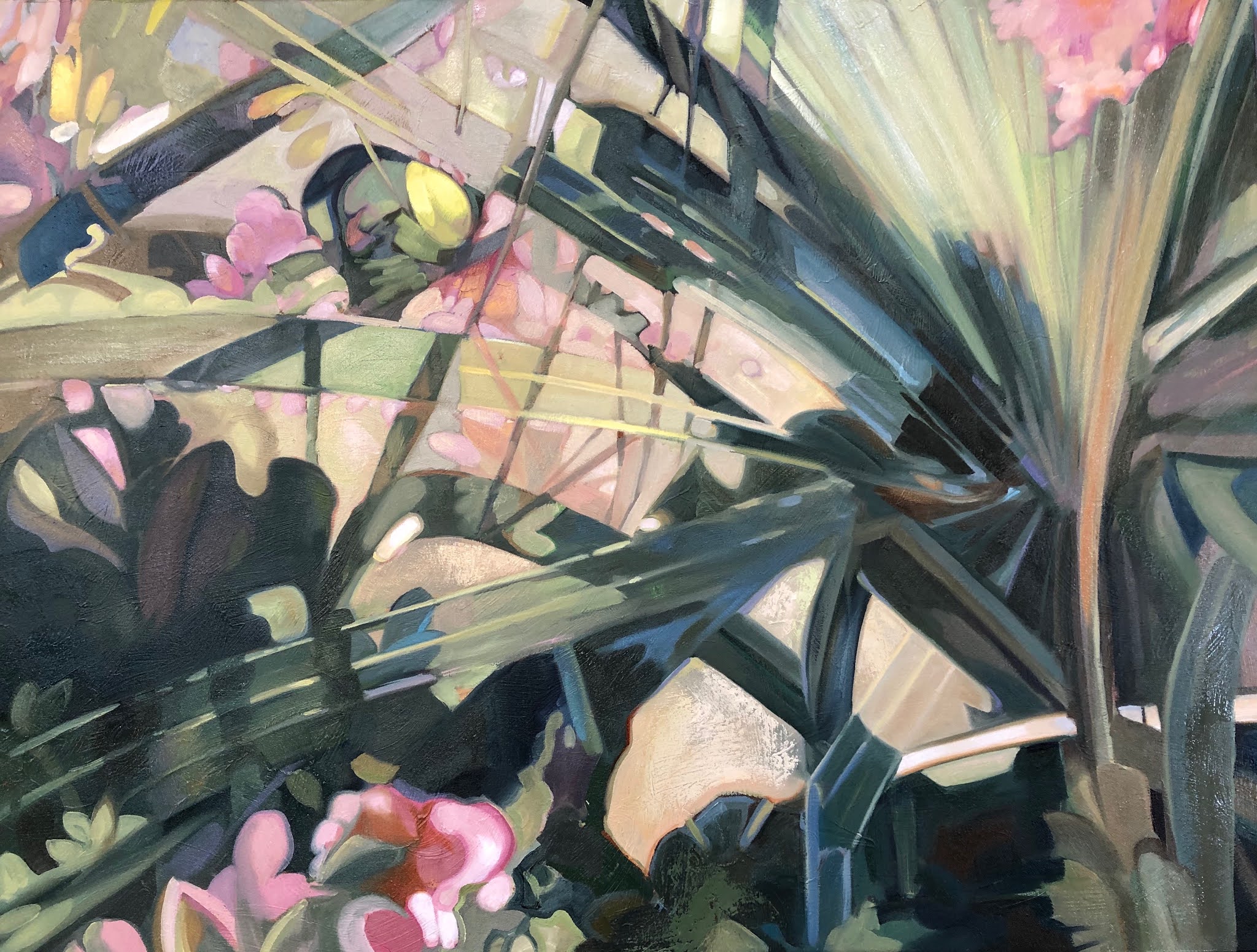
sumptuous.  It is a large piece at 36" x 48". I tend to work best at 
night, though I often wish it weren't so.  I have to get chores off my 
mind before I can dive into the concentration painting requires.  I 
did this piece over a three week period, but if I had worked more 
consistently I could have gotten it down to about a week, not including 
drying time.  The last coat was the most interesting.  After I got the 
sketching and base colors worked out, and I knew where everything 
went, I was finally able to loosen up the top coat.  I like it to 
look at once dashed out and carefully planned.  


Being a collector of coins etc.  I like to view my collection of progress 
when I am into a run of pieces, allowing each piece to inform the others.  
It also allows me to push my own envelope, trying to "allow" myself 
certain deference to my neurotic attachments to details, then to move 
past them and "allow myself" to get looser and take more chances.   
That make this my temple of sorts I guess, and color field health spa.

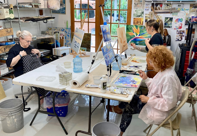
 The view of the studio, my faithful painting companion and 
a view of the workspace. Some times I will start in charcoal, 
sometimes directly with a filbert drawing with sienna or black.
I like charcoal because I can work out the composition and 
values with relatively little investment and it is very easy to 
change on a dime with a finger, smudge, or brush.
It allows me to visualize the final product in Notan notime!


Classic work usually lays down a wash with turpentine mixed
into the oil paint laying down thin layers.  Shadow and linear
details can then be used with a little less turpentine and map
out the darker areas, while wiping away the highlight areas
with a finger in a rag,  or brush damp with turpentine.  Then
minimal amounts of color quickly start to illustrate and bring
out the potential of the painting.


I liked the painterly way it was going, 
but I was not trying for such moodiness 
in this piece, so note to self, for next time.


So as I started making the final push to finish this, I noticed my 
brush dragged and tugged against the canvas and seemed to fight 
me.  I decided to use an old oil technique where you coat the 
whole surface of the piece with linseed oil, very thinly and 
carefully.  This allows the brush to glide over the surface with 
the paint allowing it to feel more like calligraphy than a tug 
of war.  It really added a juicy quality to the strokes and work 
ability of the surface.  It allowed me to  get soft misty strokes 
or rich saturated applications in little time or effort.

 Below: An Overview and a closeup detail zoom.


Todays Wednesday Custom Art Lessons

 Here are some students engaged each on their own paintings, I help each one at their unique level. Each of my students are amazing creative...