Thursday, March 2, 2017

"Feast of the Flowers"

The original name of Florida was named by Ponce De Leon as "Feast of the Flowers". 
I seized on this theme some time ago, fascinated by the realization that Ponce de Leon
must have had upon setting foot on Florida soil. Any walk in the forest here will render
just that, when one is looking, something is in bloom at all seasons of the year here. 
I did this piece from a view of my back garden while soaking in my jacuzzi, enjoying
early morning mists there.  I have done this in several ways and in different mediums,
watercolors and acrylics.

Below: I started with a loose composition sketch and some use of masking fluid to preserve white.

Below: loose broad washes set the misty tone, using oranges into the purples to introduce light.  Using saran wrap to get leafy texture into wet washes.
 

Remove the masking fluid.


Color in the whites to appropriately tone the flowers, 
and add leaves in purples and greens to differentiate warm and cool greens.


Below: Two more versions of the same theme, the first is another watercolor version, the second is an acrylic.  They can be viewed in www.gordonmeggison.com


watercolor

Acrylic


Warm and Cool Light on the Beach, A Watercolor Version

 At the rate I turn out demos, sometimes I rely on other artists to learn and use as examples for the students.  I didn't do the painting (an oil) originally, but I liked the way it successfully used warm and cool colors to capture the mood and temperature of the beach.  So I thought I would like to try this in watercolor.
go to www.gordonmeggison.com for a look at more watercolor pieces


Below: My finished watercolor version.
see the closeup after the demo pics


Remove and tint the white spaces that were protected by the masking fluid.
 

Light on The Water

My sister in law just took up photographer, and while showing me her new shots near her pond, I spotted this one for the light.
In my Reddi Arts class, I did a demo to show how I would handle this theme.  First I wanted to emphasize grasping the lyrical lines in the composition to make it more interesting.
Where you see the whites I had put masking fluid, this pic was taken after I had color washed the piece, then removed it.

Next I wanted to put a nice colorful swath inside the white zone 
with tiny bits of peach showing as reflected sunset light on the water. After that is 
dry it is time to add foreground details, grasses etc, and a light preliminary coat
of color on the egret.  I try to keep the plant details "flat" so that they feel open as 
color field spaces, rather than tightly detailed "leaves". 

Below: The final product.  I gave the painting to Jan for Christmas!

Reflections of Kingsley's Past

North of Jacksonville, is a secret spot of mine, on Ft George Island, Kingsley plantation.  A beautiful drive, it renders much inspiration for the effort, and transports me back in time to old Florida, a quieter time.

This little inlet at Shad creek, is a favorite stop on the old country dirt road, that I try to catch at sunset, just when the light hits it this way.
Here I will demonstrate a watercolor of this theme.
First I do the drawing and mask my highlights as usual.


Then I begin the color washes in broad wet washes to set up the "light"


While the washes are wet at the bottom, I added plastic
saran wrap to create an abstract ripple effect, but left the upper portion of the water reflection for luminosity.


I remove the masking fluid
to reveal the whites after adding deeper greens in
trees and water,
using salt to give
leafy texture.


I colored the lily pads and trees with their final glazes and one of my students purchased the piece from me.  Here is the picture of it completed and framed.


The Light On A Sensual Cala Lily, A Watercolor

The cala lily is one of my favorite flowers, for it's
sensual shape.  
I wanted to show the watercolor class
at Reddi Arts how to capture the changing
warm to cool light on the flower petals, by
rendering the petals with soft carefully managed
glazing.
The drawing can be equally important because
the sensuality of the shape is an important part
of the whole design.
Next I start with yellow glazes taking care to
keep a lost edge where the color fades out.
Then I begin adding successive pink and blue glazes also keeping the "lost edges"

I begin deepening the glazes particularly in shadow.  Remember a "white" petal is really not an absence of color, it includes all three primaries, separately or together.  Together they make grey, separately they help create a glow, but must be used sparingly.
Below: I started doing the background much more loosely, since I was so careful and tight, to get the glow right, the background can be fun and playful, just going for generalities.  Lights and darks say enough, and against the lily white, it causes the flower to "pop".  I put a faint outline around the flower at first to have something to paint up to, but I keep the outline in the flower colors not the background green, that gives the flower a glow halo, and keeps it from being too harsh.  I used plastic wrap in some areas to give texture into wet washes, salt in others for "effortless" flowery background detail.

The final product!


A Fog and A Mood In Big Sur

I have always love the west coast, Big Sur in particular.  It gets socked in with fog in certain locations, and gives an air of Avalon to it.   Being an old hippie, it seems a place where dreams are born.  Anyway, I used some reference that illustrated this mood well.  First I showed the class how to sketch the piece out very basically.

Next I lightly draw the composition on, keeping the pencil light by erasing excess with kneaded eraser.  Then the masking fluid (in yellow ) is used to save the whites for later.  This allows me to get liberal with the washes in the background.

I did a wash horizontally across the page with pale cerulean and ultramarine keeping it very wet then into the wash i started adding the colors for the trees in the background first, moving to the foreground, darkening as I go. 


  After some work on the foreground details, I remove the masking fluid to expose the whites.


I finish up the foreground details, trying to keep the tree and grass details loose and connected by not one, but a variety of greens cools and warms., I also take a moment to touch up some of the whites with tint, and wave and rock details.

Saturday, September 10, 2016

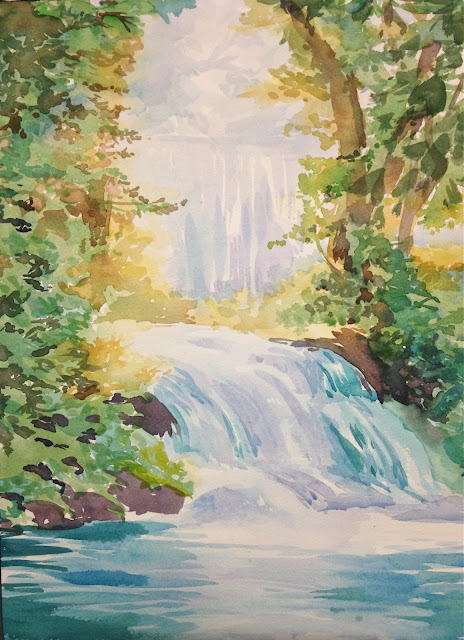
Building a Torrent of Waterfall Color


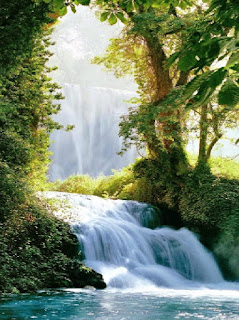
I like building my scenes slowly. Some may think I am too timid, but I want to make sure I insure that the whites are reserved in all their luminous shades.It's the way light actually bends and moves through objects in space, so the light seems to actually be on the painting itself.  Here is how I do it, in this case a Waterfall Demo at Reddi Arts one of my teaching venues.


As you can see this initial "ghost" painting (no pencil in my case) is design to both "draw in" and map out the structure and the light.  I am not interested in shadows or detail, just light.  The background is the most important since in this piece the light is behind the trees. 


I slowly add hints of the waterfall and build the wet soft light gradations wet into wet.


Once the water is fleshed out (not fully detailed yet) I move to the yellow of the forest color.  This tells me just where the warm light hits the leaves (always the yellow and lights done first).


I build on those yellow colors with my sap greens, olive greens and start moving toward the "cool temperature" greens, the chromes, sage and blue greens for the leaves in shadow.


Not that a series of "light" relationships are established halftones and shadows can be introduced.  I mixed up some burnt umber and red and blue to get a more interesting cool shadow.  Burnt umber by itself can look a bit dead, so the other two colors in the mix add some luminosity to the shadow by adding a shifting light spectrum within the mix.  I gradually move out of the shadow using burnt sienna mixed wet into wet so there is some transition to the light.  
I have also taken this moment while the watercolor in the waterfall wash is still slightly moist to add a bit of detail to the aqua colors. By doing this while it is slightly damp it gives the stroke a soft gentler edge, I also add some light purple shadows in the shadow areas.  


I keep up this method building detail with a color related to the burnt sienna, raw sienna, a more golden light, because the leaves closer to the light would have more yellow than blue (the cool/warm on the color wheel concept).  Always be cognizant of what the temperature of your place is in the picture.


Above you can see I am starting only now to move deeper into the cooler shadow greens with cerulean and chrome, sometimes olives.  I worked a bit to try to keep an interesting aqua edge to the waterfall that both had color and softness for the cool spray on the water. Some leafy shadows above are added here with olives and a bit of cerulean.


Last, with a bolder set of multi-color cool blues, and aquas, light thin purple, I do horizontal strokes for the water ripples while there is still some moisture in the paper.  If not when you put the light purples in first, then add the cool aquas boldly on top using slightly overlapping strokes in a horizontal fashion.  Be cognizant of the glow from the waterfall and the light on the water that must mirror that.

And that's all there is to it!  

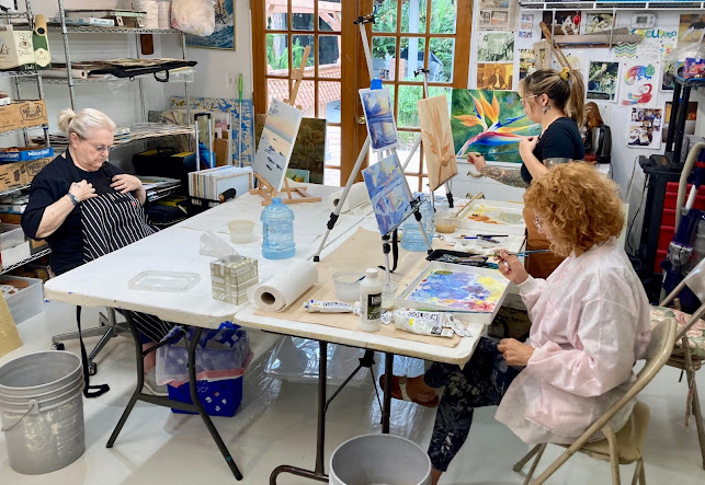
Todays Wednesday Custom Art Lessons

 Here are some students engaged each on their own paintings, I help each one at their unique level. Each of my students are amazing creative...