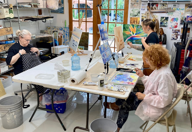
A few years ago I did a trip to visit a friend of mine getting married in LA . After a wonderful time on the southern California coast, my wife and I took a road trip up to Carmel to see the Big Sur area, an area I have been longing to paint. In class the other day I decided to finally take a crack at it, and we chose this view to demo. So here is the breakdown step by step to capture the foggy atmosphere of this magical place. I want to tackle McWay falls next! Stay tuned


1. As you can see I started with a drawing, and masking fluid, using both a small brush and drafting pen to apply it for distant foam and small branches and flowers to maintain light color fields. Then I washed in a 1-2 punch of mauve and cerulean for sky, being mindful of the fog bank in the distance, keeping a lost edge there where it merged into the sea. I used a purple (rose and cobalt) for the distant ocean, and cerulean midway, and horizon as you get closer for the beach area.

2.Using warm and neutral washes openly and in some cases dry brushed to set up the grasses and slope fields.

3. Distant mountain used blues and light magenta staying delicate to maintain a sense of distance.
Then I added bright and deeper umber greens for shadow grasses

negative space into the shadow with dark green allowing some evidence of
supporting branches underneath the bush.

5. The overview , as you can see the big tree is not thoroughly fleshed
out yet, it could be left like that for a looser look.

6. I put a second soft neutral wash on the beach, they have to be done as
lightly pigmented glazes.

7. This painting is taking on the careful "English style" of 19th and
twentieth century style classical watercolor methodology, which
concentrates on series of glazes for subtle shifts in tone in atmospheric
pieces.

8. Using the fan brush I put in a few grass like strokes, try not to
overdo the use of the fan brush even as it is exciting to use.
Be sure to keep good things that are happening already in the piece, so
as not to overwork the piece. KEEP IT FRESH.

8. Adding yellow glazes at the top of the bushes in the foreground to
create highlights, I really should have kept some open white space there
for a more dramatic effect.
I also lightly color glazed in some neutral blue gray in the sage brush
under story so they would not be too white. Next added some preliminary
yellows into the flower areas and grasses. Used the fan brush again to
add purples, and blues intermittently for more grass details.

9. Started added shadow and detail glazes to the hills below.

10. An overview of the work so far. Compare to when we started session 2.
Colors have been subtly deepen using glaze technique.

11. Working in the tree, I felt like I was missing a warm yellow highlight
in all that blue-green, so added yellow glazes in segmented method.

12. Then added glazes of burnt umber and burnt sienna next to the yellow
green to warm up that left side a bit. Trees have warm
under stories usually because of the dead leaves that fall low, and the
branches themselves, so putting them into even a blue tree can add
structure and "grounding" to the picture.
I was also working the undersides of the tree canopy to add darker green
shadows, made up of indigo, chrome, even sap green and burnt umber.
I also put some cerulean blues up in the high parts of the trees in the
outside to make some branches look farther away.

13. I was using the Hake brush lightly as I moved away from the big tree,
sliding downhill toward the bush, still working with the shadow color, I
finally ended up on the top side of the small bush, with a light negative
space glaze detail to delineate the bush a bit to help show off the
yellow, which til then was merging too much into the background.

14. Another overview so far. I believe I hit it yet again with some burnt
umber to warm it a bit next to all those cool greens.

15. This photo is poor, but I am showing some detail around the
flowers using "C" strokes to surround the yellow flowers a bit with green
which helps to bring them out a bit.
I also put in some horizon blue and cerulean blue and green upright
strokes in as negative space strokes around the sage branches to
strengthen contrast.
Try no to over work this, a few strokes is all you need. Let the water
do the rest!

16. A detail of the work around the downhill slope, creating shadows and
warm and cool spots, as well as directional lines, see the hill details.

17. The Mountain in the background seemed too strong so I put a
bit of water on the left side and gently lifted some color there,
then put a couple of light blue glazes carefully on the right shadow
side of the hill for contrast.

18. I added some color glazes to the ocean and foam, a thin glaze to bring out the fog bank a bit,
this is effectively a finished overview. I plan to add a bit more color to the sky and ocean next.


No comments:
Post a Comment