Sunday, June 5, 2016

Illusionism: Capturing Luminosity and Mood

"There is no real light on the canvas, just the illusion of real light coming from
 it's surface" I said as we looked at the phone screen exploring the work in 
admiration of Joseph Mc Gurl.  I was having lunch after class with a good 
friend of mine Henry Von Genk ( www.henryvongenk.com ) the other day, 
and he was speaking favorably about a new artist he discovered named 
Joseph McGurl.  McGurl's work displays a fine ability to capture light,
 mood and luminosity through deft use of oil glazing, a skill not often
 practice by artists today.  I thought later, that it would be fun to try to do
 the same painting in acrylics to see if I could get the luminosity using 
acrylic glazes, and extender.
Below: A painting "Transfiguration - Oil on Panel - 20 x 36"
  (for more work by by Joseph McGurl see  www.josephmcgurl.com )

 As you can see there is a classical sensibility , and a highly disciplined level of 
glazing required to achieve this smooth graduation of light and "glow".  I will not
 have the luxury of oil to give me loads of open time, so I propose to show how
 to properly use extender and glaze combinations to buy more open time
 so we could achieve the subtle shift of light we need.   So let's begin.  
I am using Golden acrylics and some Liquitex brands and a small 16" X 20" canvas.

Below: 
First I color washed the canvas with a raw sienna with a small amount of burnt sienna
 and water mix to give a warm base and to "kill the white"!  Then I started the drawing
 with a filbert brush and a mix of burnt sienna and burnt umber, "blocking in" the
 shadows , and creating a halftone effect.  I am not concerned with details.


Above:
Next I worked in some base lighter glazes that would eventually be highlight areas.
  I used raw sienna glaze in the grassy areas, light glazes in the sky to "map out" 
where cloud banks would be, using white and burnt umber, mostly white . 
TIP: With light preliminary applications like this, you set up a tonal base for future darker glazes to help them glow.  Dark on dark won't glow, but dark glaze on light base will!


Then I  premixed piles of paint in subtle ranges of light yellows, to blue greys.  My goal
 is to apply each portion in a map-like way, but then blending the two wet 
edges together to make a new set of blended colors creating a "lost edge "effect
 You will not get this perfect the first time.  It may come out too dark or too light,
 too blue or yellow, but glazing layers can fix that later, and will "mix in the eye".

Below: You can see I am adding more layers and working some sky color into the water areas.
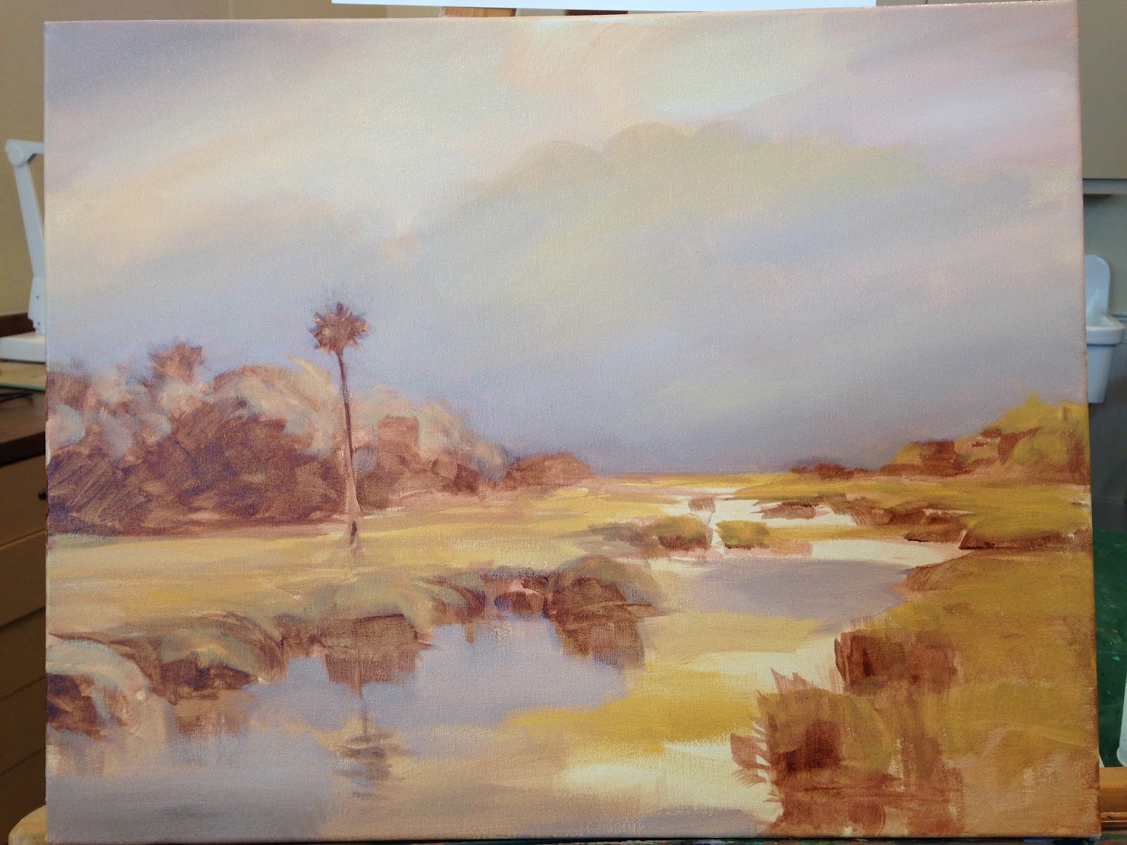

Successive layers of glazes in the sky, yellows, oranges (with white) light purple
 neutrals glazes, blue grays, burnt umber glazes overlap to create multilayered mixes
 in the eye.  In the grasses I added combinations of raw sienna and versions of
 glazed greens with chrome green, and sap to "colorize the halftone".   I  made
"muddied greens" (for shadows, using burnt umber and some purples mixed into
 the chrome and hookers green for the shadows and cool dark greens. Don't over
 simplify your greens.  It is good to have a variety of green mixes here, nature is
 complex.  I add touches of extender in light yellow and white to enhance
 the glow in the sun area, blending it out to create light rays.


Already you can see it coming together.  The sky color in the water is getting 
weaved together to set up the light base for the dark glazes yet to come.  
Some artists may leave it bright like this, and it would be OK, but I am setting 
a goal of having that mood lighting that is evident in Josephs work.  So stay 
tuned for the final portions of this.  I will deepen the sky tones, maintaining 
the lost edge effects, deepen glazes in the water to add mood 
and depth to this painting.  
 
PART 3 At today's class the steps below were the final steps 
to close the aperture on this light show!

As you can make out a blue glaze was added in several locations throughout 
the painting to deepen and cool the shadows.  I also added a richer mix of 
chrome green, cerulean blue and white in a glaze in the sky area and a thin 
version in the clouds and water.  I came over the bottom corner with some 
glaze afterwards of burnt umber to deepen that still. 


Above :
you can see how I began "pulling up the lights" like turning up a light switch.
  By setting yellow oxide next to yellow, next to white, you get subtle shifts
 in relationships that tell the eye a lot of light is shining there. I added a
 bit of cool purple glazed into the water below that as a compliment
to the yellow on the color wheel.


You should be able to move this piece around to 
get a closeup view of the various elements of the artwork.

Sunday, May 22, 2016

Glazes, Extender and Brushes, Oh My!

In this demonstration I was trying to familiarize the class with better brush control. It is important to use the right brushes for the right purpose and the right glazes or extender for the desired acrylic result.  In a cloud the "lost edge" is the hardest and simultaneously the most important effect in a representational piece.  I say that with the exception that an impressionistic piece is an entirely different approach, allowing a more painterly style to emerge.  In this case, achieving a soft lost edge is the goal.  I am interested in luminosity, the glow of a cloud as I see it in real life.  That is hard to capture in a photo.  Because of the layering of paint through glazing a "prismatic" effect can be achieved, creating the "illusion" of a luminous lit cloud on the canvas, when of course, in fact there is none there.  That illusionist technique is not practiced much in the art world today, but was a cherished goal in some classical painting.  It still can be satisfying today.


This picture was taken by a friend of mine in St Augustine Florida, Nancy Vail, who lives on the waters edge.  I call this Vails' View, since they see this first thing in the morning.  This little island is a rookery for birds as well and a channel connects the property to the Matanzas Inlet. She has invited us to stay many nights there so I know this scene well.


The first thing I like to do is break down the scene either in my mind or in sketch form, into a map so I know where I am trying to arrive in terms of the placement of highlight and shadow, warms and cools, and composition lines.

Above:  Next using a color wash on the 16" X 20" canvas to create a tone in the overall predominant color, I begin to sketch with a filbert the loose detail and composition.  I use the glaze in the brush to softly indicate the shadow areas.

Above: Next I add the yellows and cerulean sky color to "block in" the main body of the cloud and it's warm light versus the cool light of the sky. There should be a lighter transition using white in the sky mix, for horizon light.

In this case I am using a little glaze with a bright white flat Princeton #8.  I like the flats for this sort of work because they lay down a smoother application of glaze.  Do an area and leave it alone, it is not an oil and you don't have a lot of time.  Too much work will disturb the paint surface and make weird anomalies in the drying time.


Remember , you are working around the color wheel (see the left side) so as you move down the cloud toward the purples and away from the yellow, you may get a green if there is still too much, or any yellow in your mix, so as you move away from the orange into the purple shadow, remove the yellow from your brush and add red, use pink and add blue slowly.


 I just keep glazing in, adding small amounts of extender with carefully selected mixes of purples.
Extender is something you only use small amounts of, whereas glazing liquid you can use much more, but it dries faster too.  You can use both simultaneously to both thin and extend open time. This allows for multiple and sumptuous glazes one on top of another.  It is important though to let each coat dry or you will get a chunky surface to your painting that will not be attractive to look at.


Here is the final result of multiple glazing, I still need to add some color to the area above the treeline, that will come next.
Below: The final tweak with some deepening glazes added to the water and a few extra strokes to the marsh grasses. 

"The Old Country Church" ,A Watercolor A demonstration


Friday, May 20, 2016

BIG SUR Atmospheric Watercolor Demo

A few years ago I did a trip to visit a friend of mine getting married in LA . After a wonderful time on the southern California coast, my wife and I took a road trip up to Carmel to see the Big Sur area, an area I have been longing to paint.  In class the other day I decided to finally take a crack at it, and we chose this view to demo.  So here is the breakdown step by step to capture the foggy atmosphere of this magical place.  I want to tackle McWay falls next! Stay tuned


1.  As you can see I started with a drawing, and masking fluid, using both a small brush and drafting pen to apply it for distant foam and small branches and flowers to maintain light color fields.  Then I washed in a 1-2 punch of mauve and cerulean for sky, being mindful of the fog bank in the distance, keeping a lost edge there where it merged into the sea.  I used a purple (rose and cobalt) for the distant ocean, and cerulean midway, and horizon as you get closer for the beach area.
 

 2.Using warm and neutral washes openly and in some cases dry brushed to set up the grasses and slope fields.


3. Distant mountain used blues and light magenta staying delicate to maintain a sense of distance.
Then I added bright and deeper umber greens for shadow grasses

4.  I removed the masking fluid.  I put yellow on the beach and a bush in the foreground, painting
negative space into the shadow with dark green allowing some evidence of
supporting branches underneath the bush.

5.  The overview , as you can see the big tree is not thoroughly fleshed
out yet, it could be left like that for a looser look.


6. I put a second soft neutral wash on the beach, they have to be done as
lightly pigmented glazes.


7. This painting is taking on the careful "English style" of 19th and
twentieth century style classical watercolor methodology, which
concentrates on series of glazes for subtle shifts in tone in atmospheric
pieces.


8. Using the fan brush I put in a few grass like strokes, try not to
overdo the use of the fan brush even as it is exciting to use.
Be sure to keep good things that are happening already in the piece, so
as not to overwork the piece. KEEP IT FRESH.


8.  Adding yellow glazes at the top of the bushes in the foreground to
create highlights, I really should have kept some open white space there
for a more dramatic effect.
I also lightly color glazed in some neutral blue gray in the sage brush
under story so they would not be too white. Next added some preliminary
yellows into the flower areas and grasses. Used the fan brush again to
add purples, and blues intermittently for more grass details.


9.  Started added shadow and detail glazes to the hills below.


10.  An overview of the work so far. Compare to when we started session 2.
Colors have been subtly deepen using glaze technique.


11.  Working in the tree, I felt like I was missing a warm yellow highlight
in all that blue-green, so added yellow glazes in segmented method.


12.  Then added glazes of burnt umber and burnt sienna next to the yellow
green to warm up that left side a bit. Trees have warm
under stories usually because of the dead leaves that fall low, and the
branches themselves, so putting them into even a blue tree can add
structure and "grounding" to the picture.
I was also working the undersides of the tree canopy to add darker green
shadows, made up of indigo, chrome, even sap green and burnt umber.
I also put some cerulean blues up in the high parts of the trees in the
outside to make some branches look farther away.


13.  I was using the Hake brush lightly as I moved away from the big tree,
sliding downhill toward the bush, still working with the shadow color, I
finally ended up on the top side of the small bush, with a light negative
space glaze detail to delineate the bush a bit to help show off the
yellow, which til then was merging too much into the background.


14. Another overview so far.  I believe I hit it yet again with some burnt
umber to warm it a bit next to all those cool greens.


15. This photo is poor, but I am showing some detail around the
flowers using "C" strokes to surround the yellow flowers a bit with green
which helps to bring them out a bit.
I also put in some horizon blue and cerulean blue and green upright
strokes in as negative space strokes around the sage branches to
strengthen contrast.
Try no to over work this, a few strokes is all you need.  Let the water
do the rest!


16.  A detail of the work around the downhill slope, creating shadows and
warm and cool spots, as well as directional lines, see the hill details.


17.  The Mountain in the background seemed too strong so I put a
bit of water on the left side and gently lifted some color there,
then put a couple of light blue glazes carefully on the right shadow
side of the hill for contrast.


18.  I added some color glazes to the ocean and foam, a thin glaze to bring out the fog bank a bit,
this is effectively a finished overview. I plan to add a bit more color to the sky and ocean next.

Todays Wednesday Custom Art Lessons

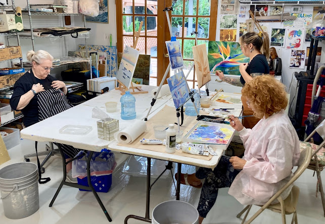
 Here are some students engaged each on their own paintings, I help each one at their unique level. Each of my students are amazing creative...